
What’s Really Driving Inflation and Bond Yields?
Long-standing questions about macroeconomic behavior are relevant again.
/s3.amazonaws.com/arc-authors/morningstar/1aafbfcc-e9cb-40cc-afaa-43cada43a932.jpg)

Timely Again
Recent market conditions have resurfaced the following questions about macroeconomic behavior:
1) What is the relationship between money supply and future inflation?
2) Does the United States government fully control the nation’s inflationary fate?
3) What determines real bond yields?
The issues are not new. However, with last year delivering both the highest inflation rate and the worst bond market in several decades, they have become particularly relevant.
Money Supply and Inflation
Milton Friedman famously said that inflation is “always and everywhere a monetary phenomenon.” Not quite. Friedman later admitted that he overstated his case. It is true that all things being equal, printing more money does create higher inflation. For example, Argentina has doubled its money supply over the past 12 months, accompanied by a 142% annual inflation rate—and, not coincidentally, the election of a new president. But things are rarely entirely equal, particularly with monetary increases that are incremental, not massive.
The following chart shows the correlation between the Federal Reserve’s most widely used statistic of money supply, M2, and inflation rates, as determined by the seasonally adjusted version of the Consumer Price Index. The calculation compares the trailing 12-month change in M2, beginning in January 1960, against the concurrent inflation rate, as well as against the inflation rates recorded one year later, two years later, three years later, four years later, and five years later.
Money Supply and Inflation: Correlations
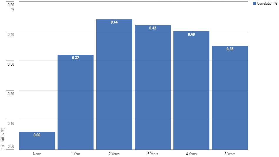
The effect was strongest when using a two-year lag, which created a statistically meaningful correlation of 0.44. That said, “statistically meaningful” does not always mean “practically helpful.” Let’s take a closer look at the two-year data.
The 2-Year Lag
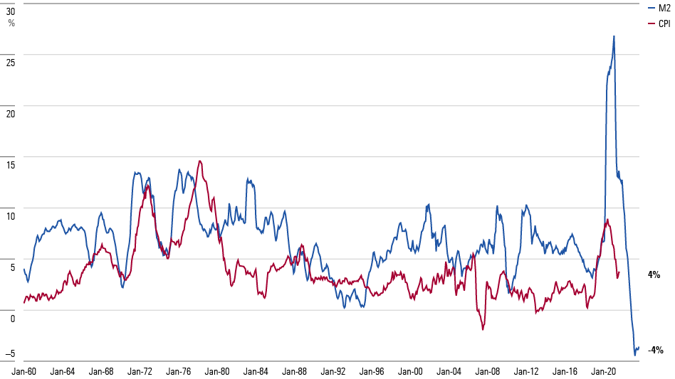
Hmmm. There was a strong link between M2 growth and future inflation both in the 1970s and again most recently. In between, though, the connection fizzled. For the 40 years covering the Reagan through Trump presidencies, the change in M2 supply failed to predict future events. To be sure, there were vague affiliations between the two lines, but the signals could not be usefully applied.
Verdict: When the money supply is rising or falling sharply, it likely will soon affect the inflation rate. Otherwise, the money-supply indicator is ambiguous.
National or Global
When prices rise, rulers fall. It held true for Marie-Antoinette in 1792, and again for the Netherlands’ VVD party this Nov. 22, when it lost the election for, among other reasons, voter concerns about the cost of living.
When inflation spikes, the people blame their country’s leaders. Sometimes, that is an emotional rather than a rational decision. Expecting the French monarchy to control bread costs was fair. For one, King Louis XVI had appointed the minister who was partially responsible for the increase. For another, the King could have adopted emergency measures. But with the Netherlands being effectively a state within a greater union, today’s Dutch government has little ability to move prices.
The Netherlands must ride other nations’ tides. Presumably, the U.S. does not. The U.S. possesses both the world’s biggest economy and also its reserve currency. Yet the recent inflation figures suggest otherwise. The next chart shows trailing 12-month inflation for five countries: in alphabetical order, Canada, Germany, Mexico, the United Kingdom, and the U.S. I have numbered the lines randomly. Can you find the U.S.?
Where Is the United States?
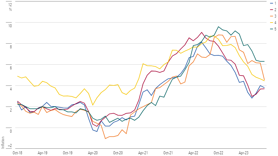
The answer is the red line, number 2. Congratulations to anybody who immediately knew that. If Goldman Sachs GS is hiring economists, you may wish to apply. For the rest of us, though, that test was difficult, if not impossible. The yellow line (Mexico) acted somewhat differently, but the other four lines moved closely in tandem.
It’s puzzling why the relationship was so tight. None of the other four countries link their currencies to the U.S. dollar. Also, although Canada and Mexico have powerful economic ties with the U.S., the European countries are less connected. Indeed, as a percentage of national revenue, the U.S. is a larger trading partner with Japan and China than it is with the major European nations.
Trading Activity With United States
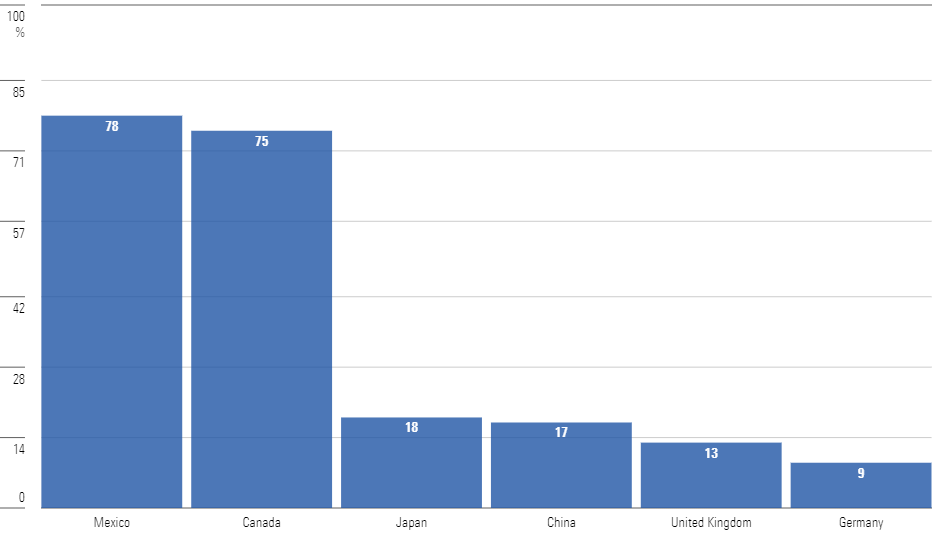
Verdict: As junior partners, Canada and Mexico have no choice but to dance to the U.S. economy’s tune. Less clear is the relationship between the U.S. and Western Europe. Why have their inflation experiences been similar? Does the U.S. cause Europe’s inflation, despite operating in a different currency and dominating the trade accounts? Or does each party influence the other?
Bond Yields
This one is just plain strange. For investors, bond math is simple. What matters is the return received after inflation. Thus, a 2% yield with dormant inflation equals a 5% yield when inflation is 3%. (Technically, real returns are derived by division, not subtraction, so that statement is not quite correct. But it is close enough.)
However, the bond market does not operate like that. We know because the existence of inflation-adjusted bonds permits us to compute the market’s inflation forecast. For issues with the same maturity date, the yield on a conventional Treasury minus the yield on a Treasury Inflation-Protected Security equals the anticipated rate of inflation. If inflation is below that rate, conventional Treasuries will earn a higher return than TIPS. If not, the opposite will occur.
One would think that bond yields would be steadier than the inflation expectations. After all, the aggregate global demand for U.S. Treasury securities would appear to be more constant than inflation-related news. Such, however, has not been the case. Over the past 20 years, the implied 10-year inflation rate, derived from 10-year Treasury prices, has hovered between 1.5% and 2.5%, with only occasional exceptions. Meanwhile, the real yield has fluctuated widely.
Real Bond Yields and Inflation Expectations
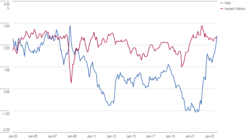
Economists have spent much cyber-ink attempting to understand why real bond yields are so unstable. The upshot, says Boston University’s Laurence Kotlifoff: “It’s a mystery.” Yes, it is. The investment lesson, though, is straightforward. Consider buying bonds when their real yields are high, which they are today. Avoid them when their real yields are low, as they were entering this decade.
Verdict: Although we don’t really know what determines real bond yields, in this case ignorance is acceptable. Following the breadcrumbs will suffice.
The opinions expressed here are the author’s. Morningstar values diversity of thought and publishes a broad range of viewpoints.
The author or authors do not own shares in any securities mentioned in this article. Find out about Morningstar’s editorial policies.
/cloudfront-us-east-1.images.arcpublishing.com/morningstar/CBGXB44AUBHWHKWNTURURHQIHE.jpg)
/cloudfront-us-east-1.images.arcpublishing.com/morningstar/XLSY65MOPVF3FIKU6E2FHF4GXE.png)
/cloudfront-us-east-1.images.arcpublishing.com/morningstar/VUWQI723Q5E43P5QRTRHGLJ7TI.png)
:quality(80)/s3.amazonaws.com/arc-authors/morningstar/1aafbfcc-e9cb-40cc-afaa-43cada43a932.jpg)