
Inflation Accelerates, but It Isn’t the 1970s Again
Morningstar’s Bob Johnson thinks headline inflation could rise over the next year, but it is unlikely to trigger a recession.

Equity markets generally continued to rally this week, especially the Russell 2000, which made a new all-time high. However, emerging markets continued to worry about what a Trump victory means and had another rough week. Bonds also continued to express their concern about Trump, with some rates, but not all, moving higher this week.
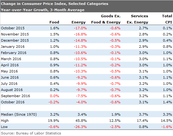
Economic news this week was generally positive, especially on a month-to-month basis. Retail sales, industrial production, and housing starts all showed nice progress, lifting the cloud of impending doom that was hanging over many economic statistics. We do caution that most of these metrics made little improvement on a year-over-year basis, but they did not get any worse. Inflation did heat up, causing some concern, with the October data showing a 0.4% increase. (Most of today's piece focuses on why higher inflation worries us.) Clearly, U.S. Federal Reserve Board Chair Janet Yellen is also concerned, hinting that rates would move higher soon. The market seemed untroubled about the Fed this week, for a very refreshing change of pace. This week's release of October price data showed acceleration across both year-over- year and month-to-month data. The month-to-month data looked particularly ominous, increasing 0.4%, which approximates a 4.8% annual rate. Year-over-year inflation was also at the highest rate of the year, 1.6%, slowly and methodically approaching the core inflation rate of 2.1% (excluding food and energy items), which has changed little over the past 12 months. Together, this seems like a reason for at least some worry, and suggests that the Fed may need to take action sooner than later.
However, We're Not Going Back to the 1970s As much as we would like to say "we told you so" in terms of higher inflation, the October report was not as dire as some of the headlines suggested. Gasoline, which was up a stunning 7% on seasonal factors and pipeline issues, and shelter prices that were up 0.4%, drove over half of the huge month-to-month inflation increase. Remember, a large part of the shelter number is owner-equivalent rents, which don't represent "cash" outlays. I am sure the Fed has done the same analysis, probably looking at core inflation rates, which still haven't changed much.
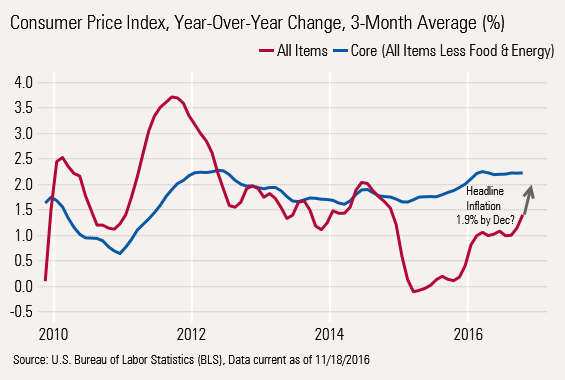
Though, no one really wants to see core rates move higher than the 2.2% rate, which the is current year-over-year three-month averaged rate. That suggests that some action was warranted as long as a year ago, but things have necessarily worsened a lot lately. As we have said again and again, headline inflation is the number-one indicator of recessions, not some hypothetically constructed "core rate."
The graph below shows that inflation does help predict how well the economy will do. The relationship between total CPI and consumption is quite tight. In fact, inflation generally leads consumption. Higher prices lead to lower consumption by several months. Periods of inflation should line up with periods of high consumption. That's why the red line, representing prices, forms peaks and troughs before the orange consumption line. To make the relationship clearer, we reversed the scale for inflation so that lower inflation rates are at the top and higher rates at the bottom. Consumption data is shown the conventional way with highest values on the top, using the right hand scale.
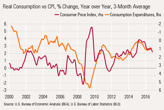
To follow up with a real-world example, in 2008, inflation reached its peak in August 2008, the lowest red point on the line, or 5.4%. Consumption reached its nadir in May 2009, the very lowest point on the graph at negative 2.9% year-over-year change in consumption. Likewise, inflation (really deflation) was at its lowest in August 2009 and consumption peaked in January 2011. The headline CPI data correctly predicted the 2016 slowdown in consumption. So far, consumption has slipped from 3.5% to 2.6% as headline inflation has moved from 0.1% to 1.6%. That suggested that consumption growth has more room to fall, especially because it will be all but impossible for the CPI data to move up given now-increasing energy prices.
Core inflation, excluding food and energy prices, can provide some of those same clues as headline inflation. There's a number of theoretical and observational reasons to favor using the headline number, at least for economic forecasting.
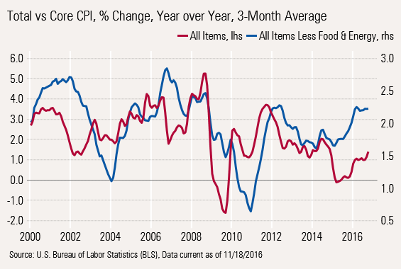
As seen in this graph, most of the time total CPI provides more lead time than core. Note the red line usually, but not always, moves ahead of the blue line. Additionally, the fact that total CPI moves over a broader range of values means that it can be easier to spot trends. That is why we had to use two different scales to make the data line up.
On a theoretical level, food and energy represent more than 20% of consumer spending, so tossing them out of the calculation is eliminating some of the real pain that consumers are feeling. It might make a little sense to toss out food and energy if a very short-term price spike will quickly reverse itself. However, using our year-over-year averaging methodology accomplishes much the same thing.
Slow-Moving Wages and Fast-Moving Inflation Are Often Key Causes of Recession The reason inflation is so devastating is that higher prices, especially food and energy, must be paid for almost immediately. However, wage increases come but once a year. The same is true of Social Security recipients, an increasingly larger part of the consumption base. The pressure might not be so bad if consumers could switch to purchasing other goods instead of the more expensive items, but that is particularly difficult in the case of food and energy.
And it gets worse. Wage increases generally move in line with core inflation and not total inflation.
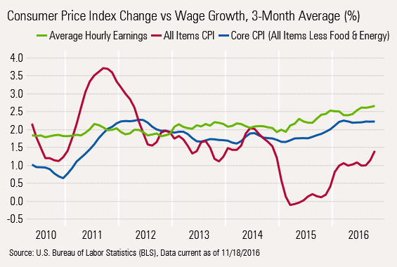
Workers Paid on Core Inflation, not Headline Inflation
In the short run, workers get raises that have some relation to core inflation. Again, there are practical and theoretical reasons for this. On a theoretical level, over the long run core and total inflation are about the same. Although food and energy prices are exceptionally volatile, over the long term, inflation rates in the key categories are relatively similar. Given this pattern, paying on core rates of inflation could make some sense. Otherwise, wages would need to go both up and down, which is something that both workers and businesses find distasteful. However, this does set up the economy for recessions as consumption slows as wages decline in real terms.
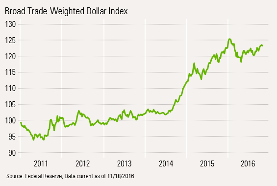
To close this thought, inflation is a key cause of recessions, no matter how it is measured. Currently, inflation is getting worse and explains the lower consumption rates we have seen in 2015 and 2016. If wage growth accelerates to cover higher inflation, the economy will do fine. With labor markets now exceptionally tight as baby boomers retire, for the first time in decades that is least a possibility. Also, the stronger dollar could keep goods inflation lower than we expected and falling food prices have been a surprisingly potent force in both helping consumers and keeping headline inflation manageable. While any gap between inflation and wages is not a good thing, the gap would need be a lot wider than we are seeing at the moment to trigger a recession. Generally, headline inflation needs to be close to 4% to trigger a recession. While we see a clear path in relatively short order, to 2.5%-3.0% inflation, a move to 4% doesn’t seem like the most likely case over the next year.
Inflation Experiences a Changing of the Guard We used the table above to show that inflation rates by broad category tend to converge over time, as shown by the averages at the bottom of that table. Also interesting is that there has been a large shift in category data over the past year. Energy price changes that had been dropping at a rate of 17% a year ago are now falling at only 4% in the most recent year-over-year averaged data (on a single-month to single-month basis energy gained 0.9%, the first increase since 2014, all but assuring energy inflation in the months ahead). Food, on the other hand, continues to fall. While not as volatile as energy, food inflation has fallen from 1.6% a year ago to deflation of 0.2%. The food category carries a weight 3 times higher than energy, and hits a wider swath of consumers.
Goods Deflation Continues Goods deflation, generally one of the lower inflationary categories because of the impact of imports, also remains below long-term averages at 0.6% deflation year over year. A strong dollar and an aging population that consumes fewer goods (and consumes more healthcare) are likely keep the pressure on the nonenergy goods category.
Services Got a Little Worse Month to Month, but Stabilized Year Over Year
Services make up about 60% of the CPI and have been running hot for some time. They have moved up modestly from 2.7% to 3.1% over the past year, but are off their peak of 3.2%. This category is driven largely by owner-equivalent rent, real rents, and healthcare. We had hoped that the completion of many new apartment complexes would have helped put a lid on rents, but rents are still up 3.5%. Higher home price inflation, which likely helps determine owner-equivalent rents, isn't helping, either. At least healthcare took a bit of a breather, registering two months in a row of zero declines. Still, year-over-year medical services are up 4.1%. Though it goes in the goods bucket, drug price growth slowed for at least one month, but the year-over-year data is still at a whopping 5%.
Retail Sales Emerge From the Dead Retail sales had been one of the softer spots in the economy over the summer as gasoline prices stopped falling and employment growth dropped. Things had picked up a little earlier in the fall, but weren't necessarily great. Now, revisions to past results combined with a stronger October make the picture look a lot better, at least on a monthly basis.
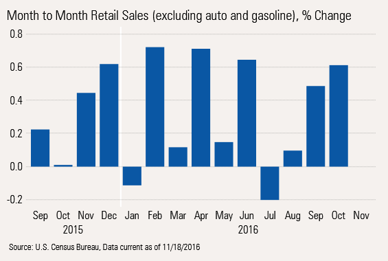
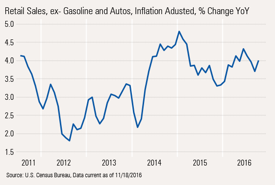
The good news is that the inflation-adjusted year-over-year averaged change data has stopped going down and the bottoms and the tops in growth both seem to be moving up.
I am guessing that deflation in a lot of categories has jump-started the unit growth and maybe even the dollar growth in several categories. Although electronic goods prices always move down, October CPI data showed the category including TVs and video equipment was down almost 15%. Combining that with nominal sales growth, which down just 1.9%, implies that unit sales may have increased as much as 13%. This pricing effect may be helping along a few of the categories.
Food Deflation Driving Two Categories in Opposite Directions The table below shows the rank order of the retail sales categories for the month of October.
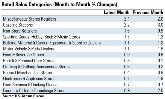
Almost pulling up the rear is the food service and drinking place category that was down a relatively sharp 0.7%. Normally, we would rate this as a pretty scary statistic as restaurant sales are a decent gauge of short-term consumer sentiment. That is, until one looks deeper, and the 0.9% growth in food and beverage stores sales jumps off the page. Lower food prices and higher restaurant wage rates are driving open a giant gap between restaurant and grocery store prices. Normally even with inflation/deflation, grocery store sales don't often move more than a couple of tenths. Now the past two months of grocery sales are up 0.9% and 0.6%, respectively. Clearly, lower prices are helping move groceries and even change consumer behaviors. I suspect that if goods prices and food prices remain low overall, retail sales may hold better than we would have thought just a few weeks ago. And it could make for some nice bargains over the holidays as a lot of key shopping categories have seen deflation over the past year.
Housing Data Manages to Confuse Yet Again Housing starts data is always exceptionally hard to interpret because changing weather and seasonal factors can quickly shift housing starts data into a relatively random pattern month to month. That's why we weren't terribly excited by a really strong month-to-month starts number and a new high for the year. Instead, we would focus on the year-over-year, rolling 12-month data with a preference for permits, because they are less affected by weather.
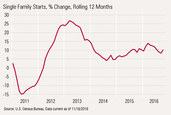
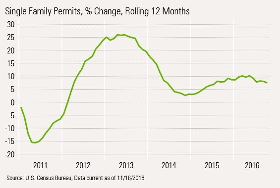
However, in the long run, permits and starts should move in similar ways with starts lagging permits by a few months. In our analysis today we will look at only the single- family data, which is what really counts. In units, multifamily runs half of what single- families do and each unit costs about half as much. So combining single-family units and multifamily units into one unweighted metric makes no sense. Looked at over time, note that permits and starts growth is nearly identical. Permit growth is running a little behind starts at 8% or so, suggesting that housing growth will not accelerate in the months ahead. Though, it is unlikely to fall, either.
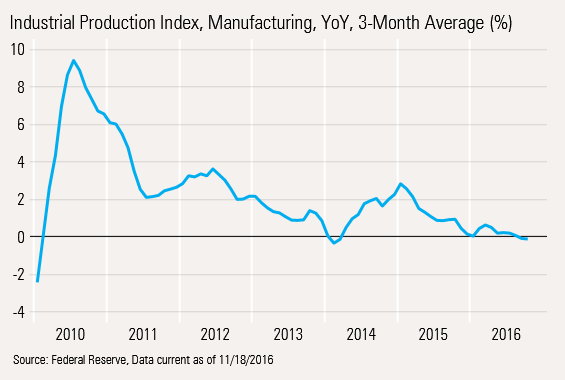
It's More of the Monthly Volatility and Weak Year-Over-Year Change for Manufacturing Like a lot of the data this month, the monthly data looks better and the year-over-year pattern is little changed.
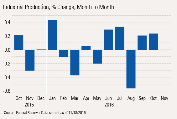
The monthly data had both a decent September and October. In fact, four of the past five months have been up. Still, one of those months was really down. That means that year-over-year averaged data is stabilizing, but at some relatively poor levels.
With a lot of auto manufacturers talking about fourth-quarter cuts and potential changes in
/d10o6nnig0wrdw.cloudfront.net/04-29-2024/t_eae1cd6b656f43d5bf31399c8d7310a7_name_file_960x540_1600_v4_.jpg)
/cloudfront-us-east-1.images.arcpublishing.com/morningstar/PKH6NPHLCRBR5DT2RWCY2VOCEQ.png)
/cloudfront-us-east-1.images.arcpublishing.com/morningstar/GJMQNPFPOFHUHHT3UABTAMBTZM.png)