
How Time Horizon Affects the Odds of Equity Investing
The reward for those who stand and wait.
/s3.amazonaws.com/arc-authors/morningstar/1aafbfcc-e9cb-40cc-afaa-43cada43a932.jpg)

From Theory to Practice
In 1962, economist Paul Samuelson showed that when using standard economic assumptions, time diversification is a mathematical fallacy. In other words, the idea that investors should hold relatively safe assets for near-term goals while funding their long-term goals with riskier assets is false. Per Samuelson, if you have liked stocks for 40 years, you should like them equally well for one month.
Future researchers have hedged Samuelson’s finding, but they have not disproved it. Yet his finding remains ignored. Along with other investment websites, Morningstar routinely publishes articles that presume time diversification. So do investment professionals, when creating portfolios. For example, every target-date 2050 fund owns more equities than any target-date 2025 fund.
I write this not to dispute common practice—I agree with it. (Next week, I will discuss why.) My point is to acknowledge the existence of Samuelson’s argument. Ultimately, it does not persuade me. If it persuades you, though, the material presented in this article is irrelevant. Consider yourself forewarned.
Time Horizon: 1 Year
This column contains four charts. Each portrays the same information over periods of different lengths. They show since January 1926 the after-inflation returns for four portfolios: 1) 100% U.S. large-company stocks, 2) 60% stocks and 40% intermediate-term U.S. government bonds, 3) 30% stocks and 70% bonds, and 4) 100% bonds. The first picture, which depicts one-year results, looks familiar.
Rolling 1-Year Real Returns
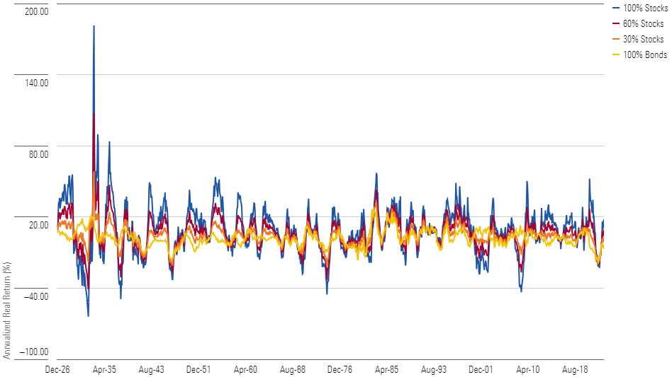
However, I did need to triple-check that early blue line! Yes, stocks did earn 180%, after inflation, for the 12 months from July 1932 through June 1933. Sadly, equities lost money in five of the next eight calendar years.
Here are the summary statistics. The table shows how frequently the 100% stock portfolio beat each of the other three portfolios. It also indicates how often each investment suffered a double-digit loss (again, the returns are in real terms).
1-Year Summary
| Portfolio | Stocks Winning % Against | Double-Digit Loss %(Annual) |
|---|---|---|
| 100% Stocks | n/a | 17% |
| 60% Stocks | 67% | 9% |
| 30% Stocks | 67% | 5% |
| 100% Bonds | 66% | 3% |
Surprisingly, at least to me, stocks compiled essentially the same victory margin against each of the three alternative portfolios. I thought bonds would have performed best. However, the percentage of double-digit losses matched my expectations. The more bonds in a portfolio, the likelier it was to avoid that fate.
Time Horizon: 5 Years
This picture looks different. Whereas the blue line representing the 100% stocks portfolio bounced continually in the one-year chart, neither consistently leading the other lines nor placing behind them, the five-year chart exhibits some patterns. The blue line spent considerable time below the others during the Great Depression, as well as prolonged periods ahead of the rest, in the 1950s, late 1990s, and 2010s.
Rolling 5-Year Real Returns
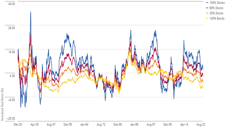
Overall, though, the outcome resembles that of the one-year time horizon. The winning percentage for the 100% stocks portfolio inched upward, but not by much. Once again, that portfolio posted double-digit losses once in every six trials. (This calculation, as well as those for the 10- and 20-periods, is cumulative. That is, to place in the loss column, the return over the entire period was less than negative 10%, rather than the return being that amount annualized.)
5-Year Summary
| Portfolio | Stocks Winning % Against | Double-Digit Loss %(Cumulative) |
|---|---|---|
| 100% Stocks | n/a | 16% |
| 60% Stocks | 72% | 16% |
| 30% Stocks | 73% | 5% |
| 100% Bonds | 75% | 13% |
The lone surprise—and disappointment—was the 100% bonds portfolio, which posted double-digit losses 13% of the time as opposed to only 3% for the single-year periods. This happened because bond market problems have tended to cluster rather than happen randomly—bad news for fixed-income investors.
Time Horizon: 10 Years
The picture for equities visibly brightens when the horizon is expanded to 10 years. The blue line spends prolonged time above the other lines, including one 25-year stretch. Conversely, it trails the crowd only briefly, during three eras that occurred decades apart.
Rolling 10-Year Returns
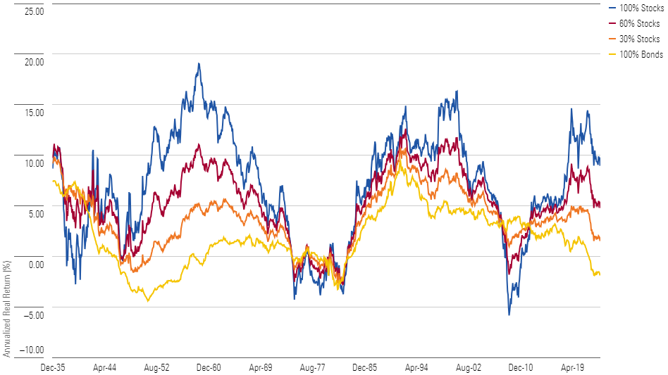
The summary statistics for the 100% stocks portfolio also progress, although the improvement remains incremental. The portfolio’s winning percentage climbs to about 80%. While impressive, that does indicate that through one 10-year period in five, investors would have been better off either mixing in some bonds or (somewhat less commonly) skipping equities altogether.
10-Year Summary
| Portfolio | Stocks Winning % Against | Double-Digit Loss %(Cumulative) |
|---|---|---|
| 100% Stocks | n/a | 10% |
| 60% Stocks | 78% | 6% |
| 30% Stocks | 81% | 4% |
| 100% Bonds | 83% | 17% |
Not that the latter choice would have been prudent. With a 10-year time horizon, bonds replace equities as the likeliest portfolio to lose at least 10% of its value. The 100% stocks portfolio experienced the largest losses, during the very worst of times, but the 100% bonds portfolio recorded more double-digit downturns.
Time Horizon: 20 Years
Extending the period to 20 years ends the contest. Since the very early observations, which incorporated the Great Depression, the 100% stocks portfolio has almost always outgained the alternatives—often greatly. Even a cursory glance at the chart yields the conclusion that the blue line is vastly superior.
Rolling 20-Year Real Returns
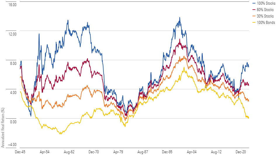
The summary statistics confirm the impression. (Not that they could disconfirm it; this picture does indeed reveal the full story.) Diluting the equities portfolio with bonds reduces its total return 93% of the time when the bond stake is moderate, 97% of the time when the position is large, and a whopping 99% of the time when bonds substitute for the entire position.
20-Year Summary
| Portfolio | Stocks Winning % Against | Double-Digit Loss % (Cumulative) |
|---|---|---|
| 100% Stocks | n/a | 0% |
| 60% Stocks | 93% | 0% |
| 30% Stocks | 97% | 0% |
| 100% Bonds | 99% | 19% |
At 20 years, the risk evaluation is reversed. Bonds are the true danger, routinely realizing double-digit losses, after inflation is considered. The safe path comes from equities. Placing 30% of the portfolio into stocks eliminates cumulative losses exceeding 10%, although on a few occasions, the 30% stocks portfolio did shed purchasing power over 20 years. When stocks make up either 60% or the entire portfolio, however, the losses disappear. In none of the historic 20-year rolling periods did either the balanced or the 100% stocks portfolio land in the red. They always gained at least something.
The opinions expressed here are the author’s. Morningstar values diversity of thought and publishes a broad range of viewpoints.
The author or authors do not own shares in any securities mentioned in this article. Find out about Morningstar’s editorial policies.
/cloudfront-us-east-1.images.arcpublishing.com/morningstar/ECVXZPYGAJEWHOXQMUK6RKDJOM.jpg)
/cloudfront-us-east-1.images.arcpublishing.com/morningstar/KOTZFI3SBBGOVJJVPI7NWAPW4E.jpg)
/cloudfront-us-east-1.images.arcpublishing.com/morningstar/V33GR4AWKNF5XACS3HZ356QWCM.jpg)
:quality(80)/s3.amazonaws.com/arc-authors/morningstar/1aafbfcc-e9cb-40cc-afaa-43cada43a932.jpg)