
Pot Kettle Black: Active Funds and the Index Concentration Argument
We are the index and the index is us.


The chart below plots the returns of two investments. One’s an active stock fund (returns shown before fees), the other an index fund. Which is which?
Growth of $10,000
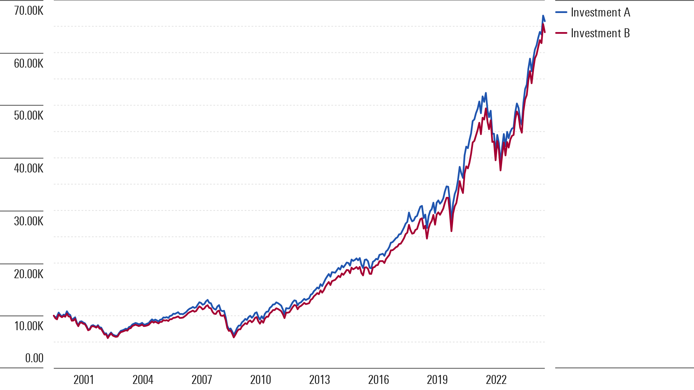
You’d be hard-pressed to tell the difference. The two perform almost in lockstep, earning nearly the same return in the end.
What closet index fund is this? It’s not any one fund. It’s a composite I built that consists of every active large-cap fund that existed over the past 25 years. To build it, I aggregated all active large-cap funds’ holdings each month, weighting each fund by its assets, repeating each month. Then I derived that composite’s monthly returns (“Investment A” in the chart shown, in case you’re wondering which was which).
Mirror, Mirror …
Indexing critics claim, among other things, that index funds are the tail wagging the dog. The way they tell it, investors pour money into index funds, the funds shovel those dollars into their top holdings, and the portfolio gets ever more concentrated. This, they say, makes index funds a kind of perpetual motion machine, distorting the value of its stock holdings.
Were this the case, though, you’d expect active managers to stand their ground, avoiding the stocks sitting atop index funds in favor of others. And yet when you lump all active large-cap funds together it looks an awful lot like … the index.
To illustrate, here is a table that shows the S&P 500’s top 10 weightings as of Nov. 30, 2024. Next to it I’ve shown active large-cap funds’ aggregate percentage stake in those same names (weighted by the funds’ assets) and, for control purposes, the weights of a blended index whose composition matches the style (value, blend, growth) of the funds.
Active Funds' Aggregate Weight in S&P 500's Top 10 Holdings
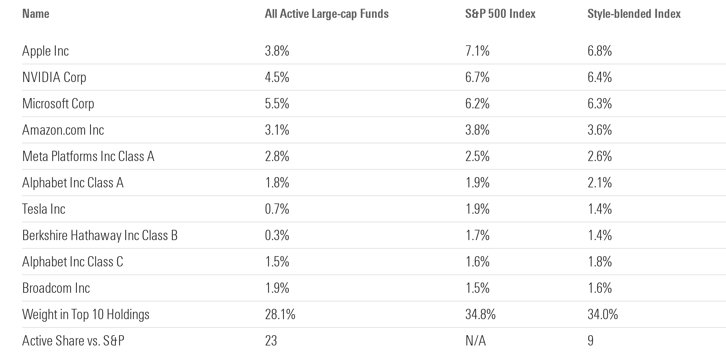
From the table we see active funds owned similar percentage stakes in these names. That is, the S&P’s concentration seems to closely resemble that of active investors as a whole. True, active large-cap funds are slightly less concentrated than the index. But they’re just one part of the market, with other pools of capital elsewhere adding to the tallies shown.
Notwithstanding that, the active large-cap funds had an “Active Share” of just 23 versus the S&P, and almost one third of that active share can be explained by style differences to the S&P (for example, see the blended index’s active share of 9). All told, that indicates active large-cap funds exhibited a low level of “activeness” in aggregate when compared with the index.
Fluke?
Could that just be a one-off? It’s not inconceivable. The market has become more concentrated in its top names, as shown below.
S&P 500 Index: % Weight in Top 10 Holdings
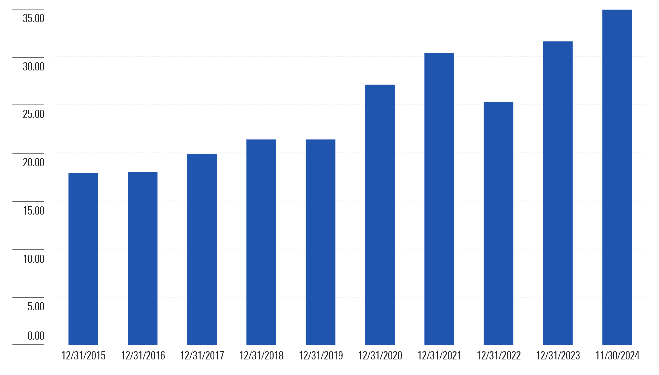
And so maybe the resemblance boils down to the fact that with so much weight congregating in the S&P’s top stocks, active managers didn’t have the luxury of going their own way, for to do so could prove far costlier than it had in the past when the index wasn’t as top-heavy.
Yet, when you examine active large-cap funds’ holdings going back through the years, you see more or less the same picture: taken together, the active funds look like the index. To illustrate, here’s the active large-cap fund composite’s stake in its top 10 holdings compared with the S&P’s on Dec. 31 of each year from 2015 through 2023, and on Nov. 30, 2024. I’ve also shown the active funds’ active share on those dates.
% Weight in Top 10 Holdings: Active Large-Cap Funds vs. S&P 500 Index
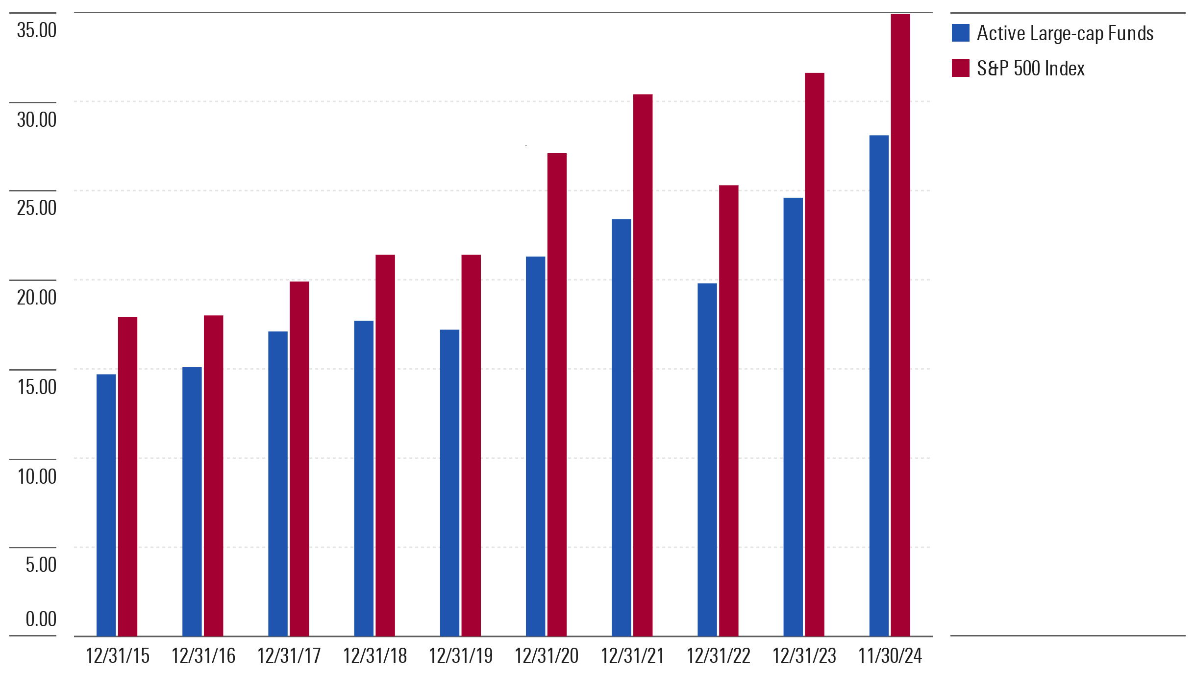
To summarize, as a group, the active large-cap funds concentrated in their top holdings to a similar degree as the index. Moreover, as the index’s concentration fluctuated, so did the active fund composite’s, and its active share barely budged throughout this 10-year span.
So What?
None of this is new. In his seminal paper, “The Arithmetic of Active Management,” William Sharpe posited the notion that the average actively managed dollar must earn the same return before fees as the index. All I’ve done is draw on funds’ reported holdings and returns to hang a few numbers on Sharpe’s construct, which seems to bear his arithmetic out. And why? Because the active funds' holdings largely resemble the index’s. We are the index and the index is us.
That lesson shouldn’t be lost on investors being warned that the S&P 500’s concentration in its top holdings represents a critical defect of cap-weighted indexing. If that makes indexing defective, what does it say about active funds, whose holdings aggregate to form the index’s weightings in the first place? Same today as it ever was.
And not that we needed reminders, but it also reinforces the zero-sum nature of active investing. To be sure, the active funds we examined here don’t constitute the market as a whole, and they’re not all carbon copies of each other. Some will top the index handily, others will lag by a lot, and many more will hover around it. But as the first chart shows, these active funds deliver an indexlike return before fees (and sink underwater after). As such, most investors are probably better off investing in a stock index fund.
Switched On
Here are other things I’m reading, listening to, and watching:
- The Long View podcast (of course!): Best of Investing and Best of Financial Planning and Retirement
- Ben Carlson and Michael Batnick discuss how to get retirees to spend, dubious Wall Street forecasts, what makes a good airplane movie, and lazy rivers on the Animal Spirits podcast.
- Christine Benz discusses our latest retirement spending research.
- Amy Arnott on why you probably ought to rebalance your assets.
- PitchBook’s private-market smorgasbord: Outlooks for distressed debt, private credit, tech IPOs, and high-yield bonds.
- Larry Swedroe makes the case for “evergreen” private-market funds.
- “Charts from the Vault,” (which inspired this article) by Counterpoint Global’s Michael Mauboussin and Dan Callahan.
- Greg Kot’s 2024 mixtape!
- Oakmark’s Bill Nygren on what the NFL Coach of the Year Award can teach us about investing (“Corporate culture is all about sharing the stories of the events and decisions that shaped us into the business we are so proud of today.”)
- Everything else under the sun: Read Tadas Viskanta’s “Abnormal Returns” blog.
Feed Me!
I love hearing from you. Have some feedback? An angle for an article? Email me at jeffrey.ptak@morningstar.com. If you’re so inclined, you can also follow me on Twitter/X at @syouth1 and I do some odds-and-ends writing on a Substack called Basis Pointing.
Gautami Thombare contributed to this article.
The author or authors do not own shares in any securities mentioned in this article. Find out about Morningstar’s editorial policies.

 United States