By Dan Bruns, Morningstar Investment Management LLC, and Emily Tran, Morningstar, Inc.

Retirement
How a Glide Path Analysis Can Help You Understand Your Employees’ Retirement Needs
Read Time: 3 Minutes
Data informs nearly every decision an employer makes. Yet, one employer decision that data doesn’t always touch is the default investment decision for the company’s 401(k) management.
Accessing employee data used to be difficult and limited. But now employers can access many types of employee data relatively easily. Information such as employee balance, age, salary, and savings rate can help employers figure out what type of investment solution may best help their employees reach their retirement goals.
Now that we know what employee data is within reach, the next step is to figure out how to use this data to help choose an investment solution—such as a target-date fund, custom target-date fund, or managed account.
A retirement glide path refers to a strategy that gradually adjusts the asset allocation of a retirement portfolio over time.
The goal of a glide path is to manage investment risk as an individual approaches and enters retirement. Typically, the asset mix becomes more conservative as retirement approaches, allocating more to fixed income and less to equities. This shift aims to reduce portfolio exposure to market volatility and preserve capital as retirees become more reliant on their savings.
The optimal glide path for target-date funds is a subject of debate. Specific allocation changes and timing of adjustments may vary depending on the investor’s risk tolerance, time horizon, and financial goals.
Using Data to Run a Glide Path Analysis
As an employer or consultant, you could try to process and analyze the data yourself. But you could also leverage an independent glide path analysis.
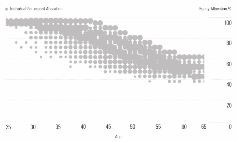
At Morningstar, we’ve developed an analytics engine that can take in employee data and then determine the appropriate asset allocation, or stock/bond split, for each employee. The appropriate allocation to stock, which is essentially the risk an employee should be exposed to, can then be plotted for each employee in a retirement plan:

Sample retirement plan. Source: Morningstar Investment Management. For illustrative purposes only. Not indicative of actual plan participants and data.
Age is plotted on the horizontal axis and the stock allocation runs along the vertical axis. In the example above, we're looking at a sample retirement plan. The Morningstar analytics engine has analyzed each employee's data and determined an optimal amount of stock he or she should have, plotting each employee on the above “bubble” chart.
Larger bubbles or circles represent a larger number of employees who the engine has determined require stock exposure.
Does the Glide Path of Your Target-Date Fund Fit?
Being able to visualize the data, like in the bubble chart above, is a unique way for employers to get a bigger picture of their employees' retirement investment needs.
To see if an existing or prospective investment solution works for a plan, the employee data can be overlaid with that investment solution:

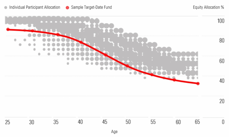
Sample retirement plan. Source: Morningstar Investment Management. For illustrative purposes only. Not indicative of actual plan participants and data.
For the sample plan above, we've plotted the default target-date fund's glide path for comparison. The glide path refers to how the mix of stocks and bonds changes as the investment vehicle gets closer to its target date (or retirement year). And for this assessment, we can plot its stock allocation as a series of dots.
Any gray bubbles that fall on the red line mean that these sample employees appear to be invested in the appropriate amount of stock, or taking on the proper amount of risk, to help meet their retirement goals.
Understanding whether a solution may be a good fit comes down to getting as many bubbles as close to the red line on the glide path chart as possible. And in this example, we can see that most of the bubbles lie far away from the line. This means the sample target-date fund in question is probably not a good fit for this hypothetical plan, and that the plan may benefit from exploring a different target-date offering or a managed accounts solution.
The sample bubble glide path chart in this post is just one example of how this method can be used. It's a robust quantitative method that we use to help employers determine how well their current or prospective solutions work for their employees.
See whether your plan's investment is appropriate for your participants. Talk to a specialist today.
Dan Bruns is a product and investment specialist and Emily Tran is a marketer for the Morningstar Retirement Solutions product group.
Please see below for important disclosure.
Important Disclosure
Morningstar Investment Management LLC is a registered investment adviser and subsidiary of Morningstar, Inc. The Morningstar name and logo are registered marks of Morningstar, Inc. Opinions expressed are as of the date indicated; such opinions are subject to change without notice. Morningstar Investment Management and its affiliates shall not be responsible for any trading decisions, damages, or other losses resulting from, or related to, the information, data, analyses, or opinions, or their use. This commentary is for informational purposes only. The information data, analyses, and opinions presented herein do not constitute investment advice, are provided solely for informational purposes, and therefore are not an offer to buy or sell a security. Before making any investment decision, please consider consulting a financial or tax professional regarding your unique situation.