
The Right Way to Read Retail Sales Data
The month-to-month numbers look frightful, but year-over-year growth is in line with recent trends, says Morningstar's Bob Johnson.
The Right Way to Read Retail Sales Data
The month-to-month numbers look frightful, but year-over-year growth is in line with recent trends, says Morningstar's Bob Johnson.

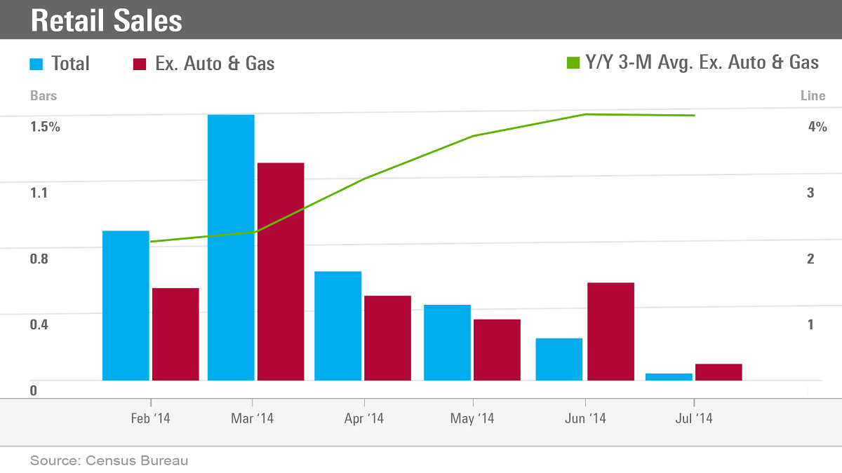
Bob Johnson: This week’s series of charts is about retail sales. Retail sales is exceptionally important. It’s 30% of consumption, which is 70% of GDP. So, it’s extremely important.
The first slide, showing the blue bars, is really scary. It shows month-to-month declines in retail sales. This includes autos, it includes gasoline, and it's not adjusted for inflation at all. And with gasoline prices falling and auto prices falling--as well as seasonal factors--you can see the pretty straight-downward slope to the line, which really has a lot of people scared.
A slightly better way to look at the number is a series of red bars, and these red bars take out the volatile auto sector and gasoline. Here, you can see there is less variance in the numbers; the range of numbers is much narrower. We just kind of have various up-and-down cycles; but nevertheless, over the last six months, we've averaged about four-tenths to five-tenths monthly growth in retail sales [minus] those other factors. So, that's not a bad number and paints a slightly different picture.
The best way to look at the data is the green line chart, which shows year-over-year data. It shows that we’re growing at about 4% overall for the retail-sales data, which is in line with what it has been doing for the last three or four years.
Looking ahead, I think the consumer will continue to perform at that level or slightly better based on an employment market [that is continuing to improve]. And, therefore, I think the data will look a little bit better than it has in the past.