
Quarterly Market Insights: Our Analysis in 5 Charts
Morningstar's second-quarter 2020 market commentary covers the yield curve, trends in U.S. investments abroad, and more.
/s3.amazonaws.com/arc-authors/morningstar/a659ddb3-1d6f-4405-a4c4-9c325330c2da.jpg)
In early June 2020, the National Bureau of Economic Research officially declared that the United States has been in a recession since February. This marked the end of the largest expansionary period in U.S. history since 1854, 10 years and eight months total. Though recessions are an expected part of the market cycle, the circumstances surrounding this one--a global pandemic and the economic response taken to manage it--have led to a unique climate.
After the market suffered massive losses in March, the second quarter saw a rebound, although not a full recovery. Much of the market's upward trend can be attributed to the aggressive steps the Federal Reserve took in response to the downturn, such as lowering interest rates and lending in corporate- and municipal-bond markets.
The easing of lockdown measures and the Fed's actions have had ripple effects throughout the economy, including equities bouncing back and an increase in retail/nonretail sales. Upon a closer look at the S&P 500, the market share of the top five companies has grown to almost 18%, fueled by substantial growth in 2020. The bond market has also been impacted from the Fed lowering interest rates as investors are looking to diversify and increase yield in their portfolios.
Every quarter, Morningstar's quantitative research team reviews the most recent U.S. market trends and evaluates the performance of individual asset classes. We then share our findings in the Morningstar Markets Observer, a publication that draws on careful research and market insights.
Here are some highlights from our latest quarterly market commentary.
Massive Fed Accommodation Fuels Dramatic Recovery The Fed made a hefty monetary accommodation in the first half of the year, including the purchase of corporate bonds, which pushed its total balance sheet above $7 trillion. Although the resulting market recovery has been dramatic, some of these actions may have exploited underlying fragility that existed before the coronavirus pandemic. For instance, the Fed's emergency lending facilities have driven corporate debt--already at record highs--even higher. This nationwide surge in debt reflects monetary and fiscal policymakers' inclination to use low interest rates and government support in an attempt to boost growth.
In addition to the nearly $2.5 trillion in net Treasury and mortgage-backed-security purchases so far this year (not pictured), the Fed is now directly involved in the corporate-credit and municipal-bond markets and is indirectly financing loans to small businesses via the Payroll Protection Program Liquidity Facility and the recently launched Main Street Lending Program. The amount committed to each of these programs is outlined on the chart below.
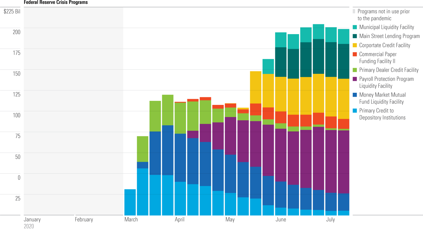
Source: Federal Reserve. Data as of July 13, 2020.
Retail Sales Reflect Efforts to Return to 'Normal' The dislocations in retail sales patterns owing to the coronavirus pandemic aren't surprising. Lockdown restrictions in March and April led to a surge in online purchases (nonstore retailers) and purchases from food and beverage stores (grocery stores) at the expense of brick-and-mortar retailers and food services (bars and restaurants). As lockdown restrictions eased, the data saw a partial reversal in May and June in some of these categories.
Still, the data in the chart below reinforce that there remains a long way to go before these patterns return to "normal."
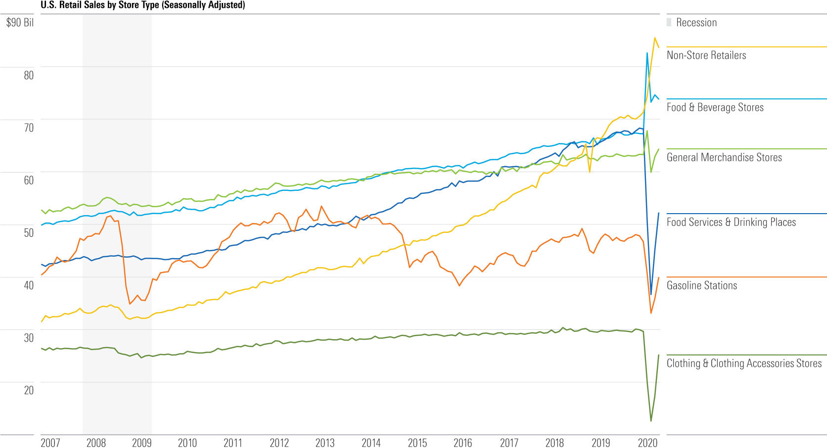
Source: U.S. Census Bureau. Data as of June 30, 2020.
The Market's Fight to the Top In the first quarter, we saw the fastest stock market drop in our S&P 500 extended index data history, which goes back to 1926. But in the second quarter, we saw the market's fastest-ever 25% bounceback, as it took only 37 days to recover from the market's low on March 23, 2020.
For reference, it took the market nearly 3 times longer to recover from its last downturn in 2009. The closest market rebound to this scale was back in 1932 after the first phase of the Great Depression, which still took 56 days. These and other recoveries from historical downturns are shown in the chart below.
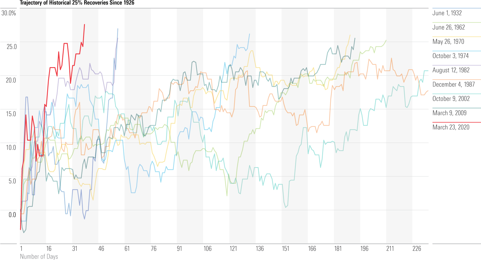
Source: Morningstar equity data. Data as of June 30, 2020.
Top 5 Companies Continue to Eat the Market Over the past five years, the market share of the top five companies in the S&P 500 (Microsoft MSFT, Apple AAPL, Amazon.com AMZN, Facebook FB, and Alphabet GOOGL) has inched up from about 10% of the index to 18%. In 2018, a divergence surfaced between the S&P 500's returns with these top five companies included and returns without the top five companies. As shown on the chart below, as of the second quarter of 2020, this divergence grew as high as 7%.
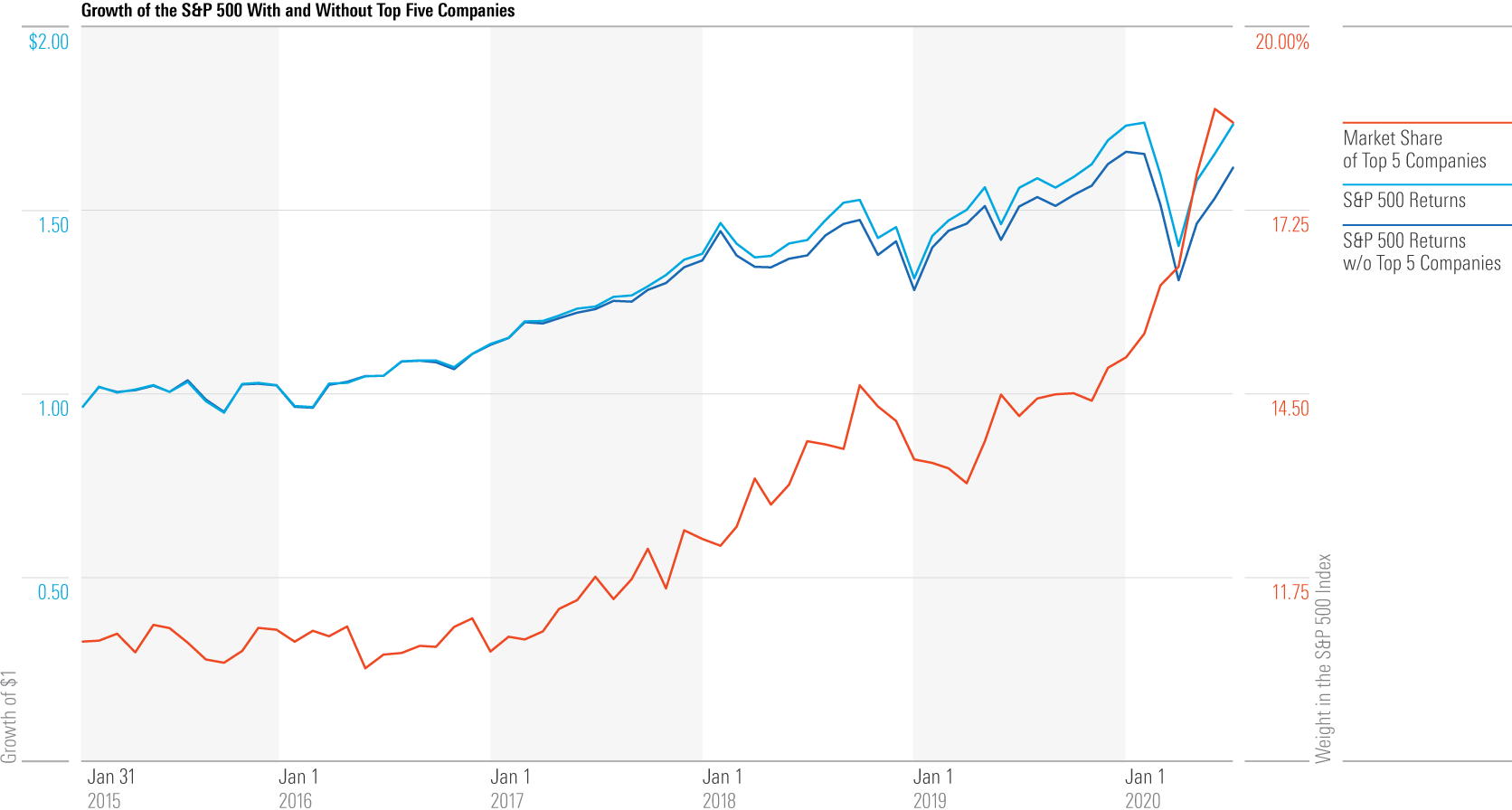
Source: Morningstar equity data. Data as of June 30, 2020.
Investors' Search for Yield Intensifies as Rates Decrease The Fed's emergency responses (lowering interest rates, increasing the amount and broadening the scope of asset purchases) caused yields to fall in the past year across the entire bond spectrum. The drop in yield across bond offerings is shown in the chart below. This came despite a weak economy, which would normally promote higher yields, owing to the extreme actions of the Fed. The risk/return equation is now misaligned for fixed-income investors, who will need to take on more risk for the same level of return compared with last year.
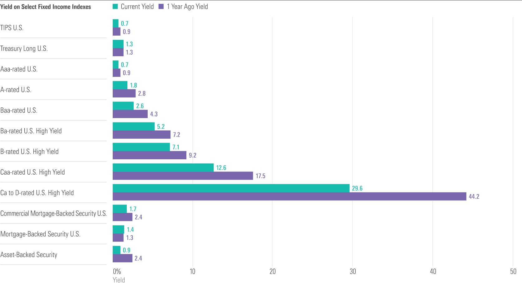
Sources: BbgBarc US Treasury USD TIPS Index, BbgBarc US Treasury Long Index, BbgBarc US Credit Aaa Index, BbgBarc US Credit A Index, BbgBarc US Credit Baa Index, BbgBarc US HY Ba Index, BbgBarc US HY B Index, BbgBarc US HY Caa Index, BbgBarc US HY Ca to D Index, BbgBarc Glb Agg US CMBS Index, BbgBarc US MBS Index, BbgBarc ABS Index. Yield data as of June 30, 2020.
This blog post is adapted from research that was originally published in Morningstar Direct’s Research Portal. If you’re a user, you have access. If not, take a free trial.

:quality(80)/cloudfront-us-east-1.images.arcpublishing.com/morningstar/PKH6NPHLCRBR5DT2RWCY2VOCEQ.png)