
Third-Quarter Performance in 3 Charts
The past quarter was a rocky ride, and there were some surprising winners.
/s3.amazonaws.com/arc-authors/morningstar/11b6f4c1-25d3-4bbc-8deb-d1c1aeedcce7.jpg)
Sometimes pictures speak louder than words. Here’s the first in a new series of market insights with Morningstar-designed data visuals. We begin with three charts capturing third-quarter performance.
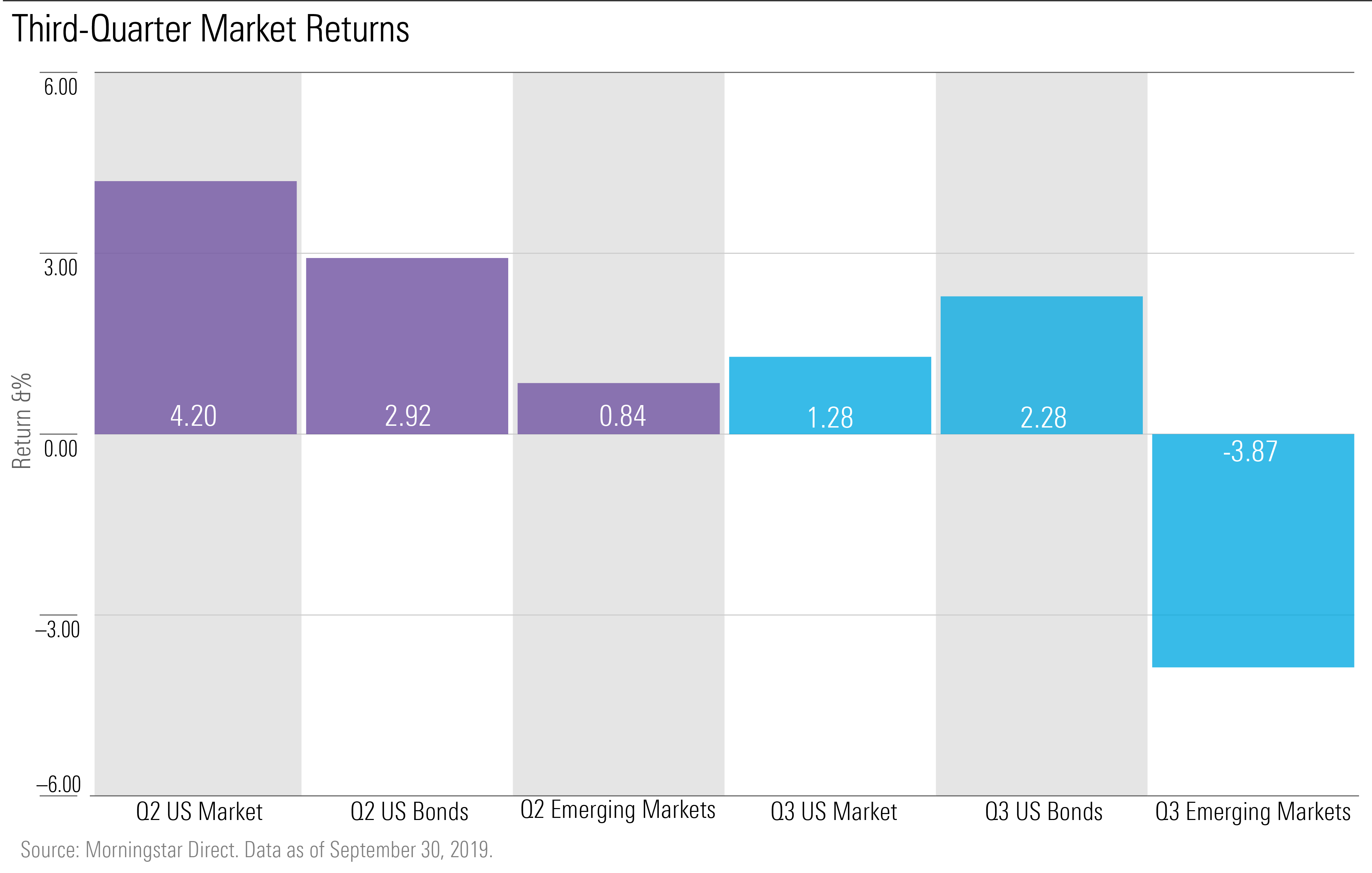
The third quarter was a roller-coaster ride for both domestic and emerging markets, but U.S. markets still led emerging markets with a 1.28% return. Emerging markets saw a loss of 3.87% this quarter. Bonds rose to the top this round; with the Federal Reserve’s two interest cuts in this past quarter, we saw an inverted yield curve.
Taking a deeper dive into U.S. markets, we see sector returns here on a heat map graph, broken down into different periods for each Morningstar sector.
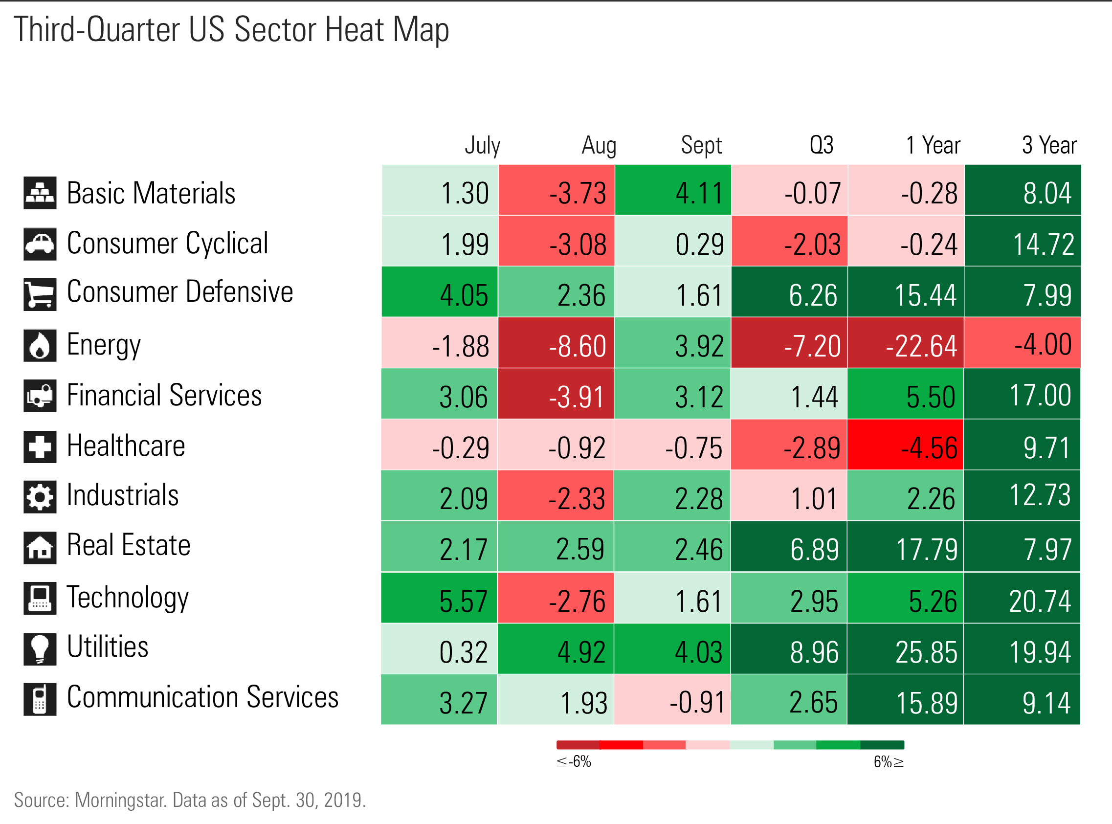
We see here that sectors sensitive to interest rates, such as real estate, fared well. Energy showed the biggest loss this quarter, returning negative 7.20%, but that has been an ongoing trend when examining one-year and three-year figures. Utilities took the lead with 8.96%; financials and communication services also did well.
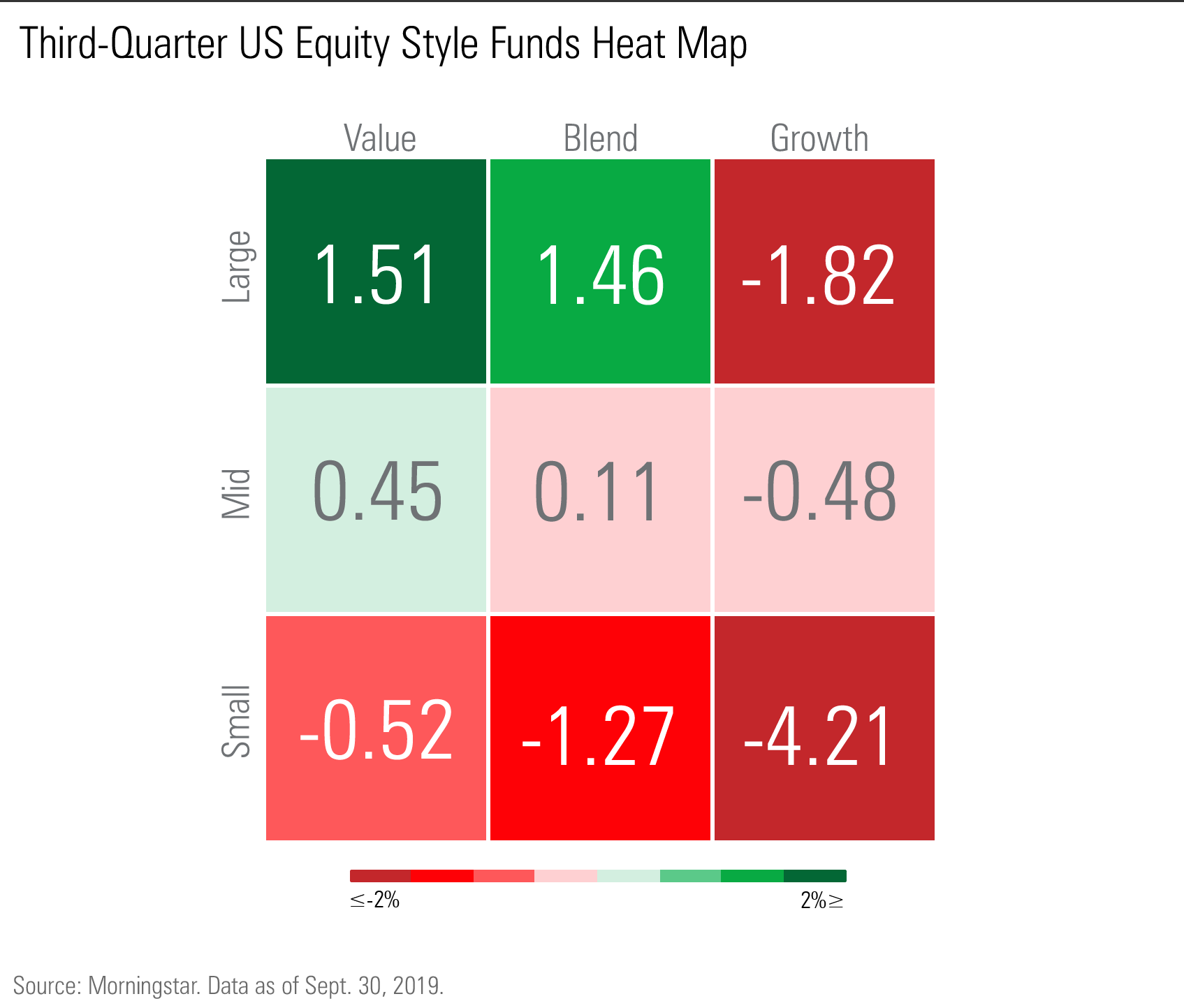
Looking at U.S. equity style funds heat map, we note that value funds led the way this quarter, beating out growth funds; growth had outperformed value since the beginning of the year.
Large-cap funds in general fared better this round, and small-cap funds saw losses across all styles.
/cloudfront-us-east-1.images.arcpublishing.com/morningstar/GQNJPRNPINBIJGIQBSKECS3VNQ.jpg)
/cloudfront-us-east-1.images.arcpublishing.com/morningstar/EC7LK4HAG4BRKAYRRDWZ2NF3TY.jpg)
/cloudfront-us-east-1.images.arcpublishing.com/morningstar/JNGGL2QVKFA43PRVR44O6RYGEM.png)
:quality(80)/s3.amazonaws.com/arc-authors/morningstar/11b6f4c1-25d3-4bbc-8deb-d1c1aeedcce7.jpg)