
What's Holding Back GDP Growth in 2017?
Slower consumption growth will weigh this year, while housing will likely make a smaller contribution versus last year.

The final scheduled revision to fourth-quarter and full-year 2016 results prompted us to take a deeper dive into the key drivers of GDP growth in the longer term and in the short run.
In the short run, slower consumption growth is likely to hold back GDP growth in 2017 despite the potential for better spending by both the government and business sectors. We are still sticking with our 1.75%-2.0% GDP growth forecast for 2017, slightly better than the 1.6% rate registered in 2016. Higher inflation rates and limited income growth will pressure consumers, especially those who are fixed-income dependent. As discussed after the GDP section below, consumption data is already off to an ominous start in 2017, with two back-to-back months of inflation-adjusted consumption declines.
In the short run, many sectors wish they had the growth rates that the housing sector is experiencing. However, poor existing- and pending-home results and slowing apartment construction will continue to offset the stronger market for new homes. This is a very long way of saying that housing will continue to contribute to GDP and homebuilders will do well, but the entire residential data set is likely to make a smaller contribution to GDP growth than it did in 2016, as we discuss in the last section of this report.
GDP Fourth-Quarter Revision Modest, Annual Growth Still Subpar The third and final GDP revision for the fourth quarter showed sequential improvement from the prior reading from 1.9% to 2.1%, above market expectations. The revision is what we describe as a high-quality revision as the biggest change was in consumer spending. Estimates of consumer spending moved up from 3.0% to 3.5%, driven mainly by higher consumer services spending. We describe these as high-quality because they are in contrast to quirky inventory and export data revisions that are more likely to represent statistical issues rather than real changes in economic activity.
Many news outlets trumpeted the fact that the economy was growing faster than expected in the fourth quarter. Still, recall that even with revisions the fourth-quarter growth rate was still substantially below expectations as of early December.
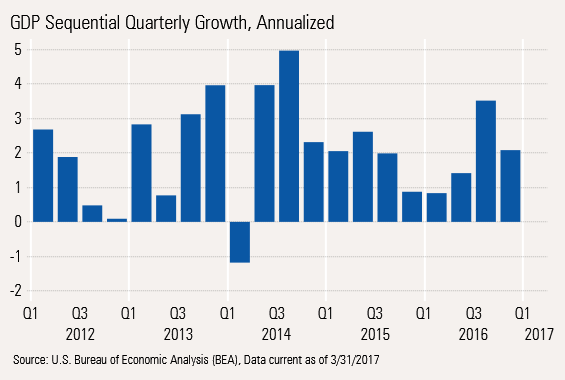
Long-term readers will remember that we aren't fans of the way quarterly GDP growth is reported. Almost all analysts focus on sequential growth rates, in the most recent case third quarter over fourth quarter, that are annualized and seasonally adjusted. We have a real problem with both parts. The annualization process magnifies even small changes, effectively multiplying quarterly data by four. Plus, government statisticians can't seem to get the seasonal adjustment factors to make logical sense.
It's not that the government statisticians are incompetent, but their task is nearly impossible. To avoid any politically motivated monkey business, they are largely precluded from making a lot of manual adjustments for special events such as cold weather, strikes, recessions, and so on. They are mandated to stick to working with long-term averages. That produces a volatile and rather silly-looking picture of economic growth.
The graph below shows just the jagged quarterly GDP results with growth rates ranging from negative 1% to 5% over this nonrecessionary, five-year period. Also telling is that in most cases, the first-quarter growth bar is the smallest of the year, which just shouldn't happen if the seasonal adjustment factors were working. Finally, it's hard to see trends in the sequential results; the ups and downs appear relatively random.
We prefer looking at either a rolling four quarters of numbers or comparing same-quarter to same-quarter-a-year-ago data. The rolling four-quarter data provides the smoothest, least volatile data and is quite good at identifying long-term trends, as shown below. The four-quarter methodology narrows the range of outcome to 1%-3%. Note: we have intentionally used a wider-than-necessary scale to make the picture comparable with the sequential chart shown above. There is no first-quarter anomaly in this data set. The interpretation of trends from this data is clear. Growth peaked in the fall quarter of 2015 and has slipped modestly but steadily since then. The good news is that if you pull out a magnifying glass, the growth bars started going up again in the fourth quarter of 2016.
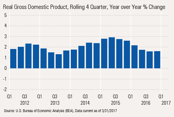
While we like the four-quarter methodology, it's not without its faults. The main downside is that it might smooth the data too much, making it hard to get early economic warnings. Given that potential for slow reaction times, we always take a peek at comparing a single quarter with the same quarter a year ago. This dampens the influence of seasonal factors and the annualization process compared with the sequential data, but provides a better early warning system.
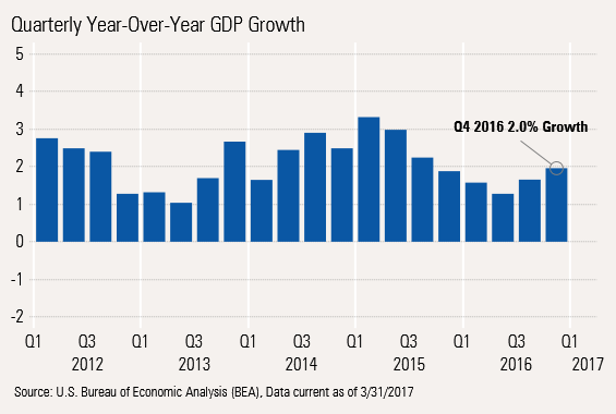
The volatility in the year-over-year measure is only slightly higher than rolling four-quarter data. However, this data set caught the 2015 peak sooner. Furthermore, this data suggests a relatively clear pickup beginning in the third quarter of 2016.
Looking at the data all three ways, the worst possible interpretation will likely be that GDP growth rates are no longer slowing and may even be beginning to accelerate once again. However, none of the data is suggesting a boom, either.
Long-Term Picture Still Shows Slow GDP Growth, Soft Investment, and Weak Government Sectors
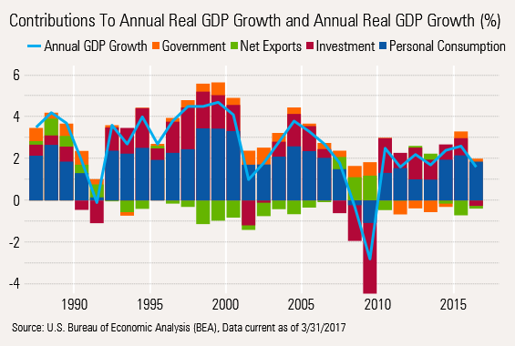
Growth Rate Contributions Show True Economic Impact Above is a longer-term graph of the relative contributions to GDP growth by the four key economic sectors. We normally present these numbers in tabular form, but the color coding produces a clearer picture of recent trends. Recall that a sector contribution combines the sector growth rate with its weight in the GDP calculation. The consumer bar is often the widest as consumption makes up just under 70% of GDP. However, the red investment spending bar can sometimes come out on top as this smaller sector (about 17% of GDP) can show wild swings in growth rates.
GDP Growth Lower This Recovery, Smoother and Longer-Lasting Our goal here is not to get too specific, but to identify a few trends. First, looking at the light blue line, the growth in GDP has never reached levels of the past three recoveries (post-1980, -1990, and -2001 recessions). However, the ride has been considerably smoother and longer than the 1980 and 2001 recoveries, but not as long as the 1990s boom period. The bars of consumer spending--still the best of a bad lot--have been constrained by a slower-growing and aging population that spends less, as well balance sheet deleveraging.
Investment Spending on Hold, One Lone Red Flag on a Recession The red investment bars were doing OK this recovery, especially at the beginning of the recovery. In fact, in 2011, investment spending made a larger contribution to GDP growth than consumption. However, in 2016, total investment was a detractor from GDP growth, declining on a year-over-year basis.
We aren't prone to reading too much doom and gloom into one year's worth of data, but we are more than a little concerned that investment spending (which includes business investment, housing, and inventories combined) has never gone down on annual basis except at the opening of a recession, with just one exception (1967), in the past 70 years.
Government Spending a Surprising Slow Spot This Recovery The government sector, at 17%, is a normal GDP stalwart. The pre-2011 data shows consistent and relatively large amounts of the orange government bars, with even wider bars during the recession, but usually providing something to the economic growth picture. Due to a combination of federal government spending restraint and declining spending and cash-strapped local governments (lower property tax collections, pension funding needs), government spending declined for four consecutive years, 2011 through 2014. The sector is no longer a detractor, but it hasn't bounced back nearly as much as we all had hoped. Potential stimulus spending at the federal level (with some block grants for the states) could lift this category out of its funk.
So Why Is Spending Going Nowhere and My Taxes Are Still Going Up? You may be asking how government spending in the GDP accounts is going down while your taxes are likely to be going up at every level. Direct government spending on buildings, roads, and direct services provided to constituencies has not gone up much. Instead, taxes are going to programs that transfer wealth including Medicare, Medicaid, Social Security, and pension funding. These aren't counted as government spending. Instead, they are a transfer payment included as a component of consumer income and hopefully, consumer spending.
Net Exports Not Hurting as Much as Usual Notice the green net exports bar is almost always a GDP detractor, except during recessions--reflecting the fact that imports, a subtraction in this calculation, are much larger than imports.
During a recovery, both grow at similar percentages. However, with imports 28% greater than exports, the net contribution is usually negative. The same phenomenon works in reverse during a recession. However, that normally predictable pattern has thankfully broken down some during the later stages of this recovery. Increased U.S. energy production, resulting in smaller imports and to a lesser degree more exports, is keeping a lid on the trade deficit.
That is not the whole story either, as aging boomers more interested in getting rid of goods than acquiring them and millennials favoring experience over acquiring things has hit the imports of consumer goods hard despite amazingly cheap prices. Normally, we would expect net exports to continue to have a more negative effect on GDP in the years ahead, as long as the recovery remains intact. However, the demographic shifts and potential changes in trade policy may break that normal pattern. It is still early to tell what will happen on that front.
Consumption Growth Slows to Meet Income Growth Inflation adjusted consumption growth remained in a funk in February, dropping 0.1% following a 0.2% drop in January.
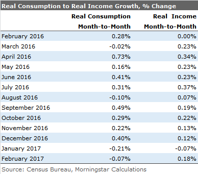
Notice that consumption grew faster than incomes, sometimes by a considerable margin for four consecutive months between September and December. Therefore, it is not a surprise that we have seen a little payback to start 2017.
A number of economists are palming off the poor recent performance to warm weather, especially reduced use of utilities. Indeed, month-to-month consumption would have been zero in both January and February instead of registering declines, if utilities are excluded--though zero growth isn't a goal many would aspire to.
And if good weather was this issue, consumers normally would have spent their incomes on other goods and services. One might suspect travel, hotels, and restaurant meals would have done better with better-than-expected weather. Instead air transportation has been down for three consecutive months; restaurant meals are down two of the last three months. Even televisions, a consumer favorite lately, a category that had been growing at a blistering pace, slowed substantially in January and turned negative in February. Normally, we wouldn't worry too much about month-to-month data, but the trend isn't pretty.
Slow Tax Refunds Are Only Part of the Answer There are also some that are claiming slower tax refunds may have been at work in the February consumption report. True, refunds were running about two weeks behind last year's pace. However, the biggest block of refunds for this tax season still managed to land in February. Furthermore, while March refunds are now higher than a year ago, the combined total for February is still behind year ago levels and is unlikely to totally close the gap this tax season (better investment returns and fraud prevention measures).
Year-Over-Year Data Income and Finally Consumption Data Slowing, Too Year-over-year consumption data had been on a general uptrend for most of 2016, despite slowing in wage and income growth. However, it looks like that slowing is beginning to catch up with consumers, as the consumer curve is now bending down, too.
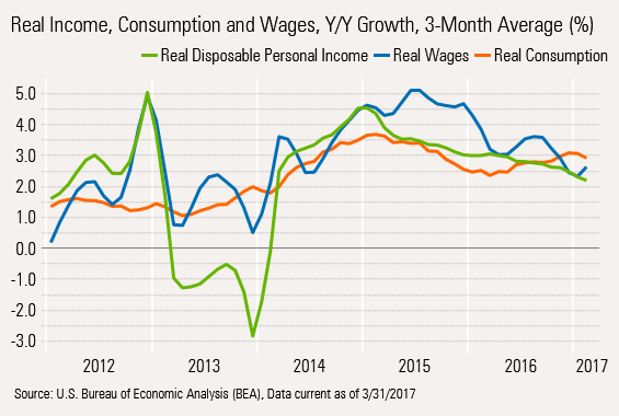
We suspect real disposable income will continue to be pulled down by Social Security recipients who will receive the same size monthly that was hardly bigger than those checks in 2016. Yet month by month, inflation will continue eat away at that static income figure until new higher checks come in 2018. That's partly why the green line above has underperformed wage growth.
We aren't sure wage growth will continue on its upward spike, either. We suspect that this year's employment gains were front end loaded as they often are. Hourly wage gains could mitigate slower employment growth in the total wage calculation, but those gains are needed just to keep up with normal, even moderate inflation. In our opinion problems in the wage and income line will likely pull 2017 consumption growth rates down to 2.0% to 2.5% growth, off from 2.8% in 2016.
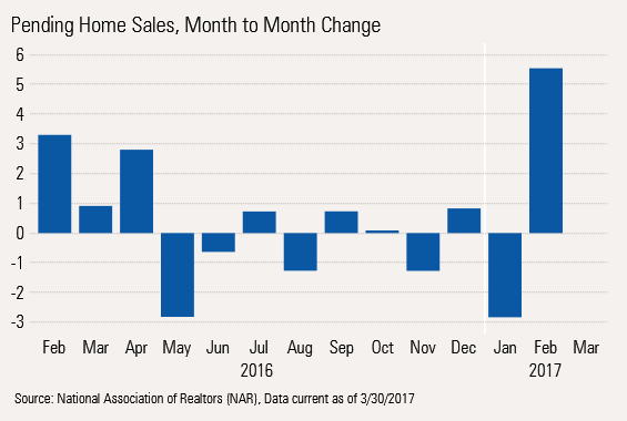
Pending Home Sales, Another Month of Mixed Messages Many economists were excited by the monthly pending home sales data which increased by 5.6% between January and February, and the seasonally adjusted data approached recovery highs. Pending homes sales represent initial contract signings, which proceed a closings or existing-home sales a month or two later.
The National Association of Realtors chalked up the better gains to a combination of better consumer employment prospects, the threat of higher interest rates, and much warmer than normal weather conditions. However, the strong February data follows an abnormally weak January, which certainly takes away some of the luster of the February report.
In addition, the pending home sales index has struggled to break out of a very narrow range over the past two years. Since April 2014, when the index was at 110, the index, which is now at 112, has gone nowhere, suggesting little growth in existing-home sales.
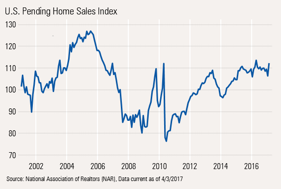
Existing-home sales have occasionally looked a little better than the pending home data suggests, but ultimately, pending and existing-home growth rates should be similar. Current data suggests that existing-home sales have gotten a boost from a rush to close sales of pending contracts to avoid interest rate increases. That rush tends to boost existing-home sales relative to pending home sales as Realtors and buyers pound on mortgage agents to work faster. Eventually, existing-home sales are likely to fall back to the slower growth rate of pending home sales.
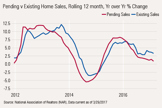
At the moment, existing-home sales are growing about 3.3% while pendings are growing just 0.9%. We believe that seasonally adjusted existing-home sales for March will be in the 5.3 million-5.4 million range, flat with a year ago and down from last month's pace of 5.48 million units. That would make brokerage commissions on existing homes a small subtractor from first-quarter GDP versus a contributor in the fourth quarter.
Housing Contribution to GDP Growth Could Be Muted For the full year, the National Association of Realtors is expecting existing-home sales to grow at 2.6% in 2017, down from 3.6% growth in 2016, suggesting that existing-home sales will be a smaller contributor to GDP growth in 2017 versus 2016. Interestingly, it is also expecting new housing unit starts growth to drop in 2017 from a growth rate of 10.8% to 5.6%, driven mainly by lower multifamily starts. These two lower growth rates for 2017 will likely mean that residential investment (a combination of broker commissions, new construction, and remodels) will make a smaller contribution to GDP growth in 2017 than in 2016. It won't help that a lot of the interest in housing is at the lower end of the price spectrum, which could make reported sales dollars to grow at a slower rate than unit starts, the reverse of what happened early in the recovery.
/cloudfront-us-east-1.images.arcpublishing.com/morningstar/F2S5UYTO5JG4FOO3S7LPAAIGO4.jpg)
/cloudfront-us-east-1.images.arcpublishing.com/morningstar/7TFN7NDQ5ZHI3PCISRCSC75K5U.png)
/cloudfront-us-east-1.images.arcpublishing.com/morningstar/QFQHXAHS7NCLFPIIBXZZZWXMXA.jpg)