
Can You Predict the Next Downturn? (Bond Edition)
Not by expecting bonds to behave like equities, you won’t.
/s3.amazonaws.com/arc-authors/morningstar/1aafbfcc-e9cb-40cc-afaa-43cada43a932.jpg)
Pattern Seeking Today's column builds upon my recent article, "Can You Predict the Next Downturn?" That article inquired whether U.S. stocks revert to the mean, so that knowing their previous performance informs their future results. The answer was "Yes," with the sizable caveat that this condition only applies to 20-year time periods, which not only makes for prolonged wagers but also permits few independent observations. That finding could easily be accidental.
Today's article asks the same question of high-quality bonds. As before, the data come from "Stocks, Bonds, Bills, and Inflation," research that was originally compiled by Ibbotson Associates and which is now owned by Morningstar. The returns begin in January 1926, are monthly, and are adjusted for the effects of inflation (that is, they are "real"). This column uses the Long-Term Government Bond Index, which tracks the performance of 20-year Treasuries.
I calculated that index’s average annualized returns from 1926 through 2019 over two rolling time periods: five years and 20 years. (I also evaluated 10-year rolling periods but discarded those results because they duplicated the five-year findings.) In each case, I then matched those “past returns” with the “future returns” that occurred during the next rolling period. For example, for the rolling five-year study, the past return from January 1926 through December 1930 was compared with the future return that occurred from January 1931 through December 1935.
In the following charts, past returns are represented by a blue line, future returns by a red line, and the median return by an orange line. The interpretation is straightforward. If the blue and red lines place on opposite sides of the orange line, then mean reversion occurred. An above-average showing was followed by below-average results, or vice versa. If, however, the blue and red lines land on the same side of the orange line, then relative performance was persistent. Relatively high past returns led to relatively high future returns, and vice versa.
Five Years
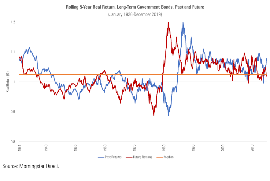
The five-year bond chart has a distinct arrangement. With a brief exception, performance was persistent. When long government bonds succeeded, they continued to succeed, and when they failed, they continued to fail. Eighty percent of the time, the blue and red lines share the same side of the orange line.
However, when the arrangement broke, it really broke. Past five-year returns hit their absolute worst--a brutal stretch ending in October 1981 that saw 20-year government bonds lose 11.3% annually, meaning that they shed 45% over the full five years--just as future returns were about to become their best. The five-year period that followed October 1981 was the study's second-highest, with the very highest occurring just one month before, commencing in September 1981.
In this instance, the picture does indeed convey 10,000 words. Or at least, it tells far more than does a conventional correlation statistic. That figure was 0.28, which suggests moderate persistence. But that was not so. As the illustration reveals, the correlation was consistently positive, aside from the decade when it very much wasn’t. Bond investors who bet on persistence picked up a great many nickels--but lost gold coins during the one stretch where the tactic failed.
20 Years
The 20-year diagram tells much the same story, but with an additional wrinkle.
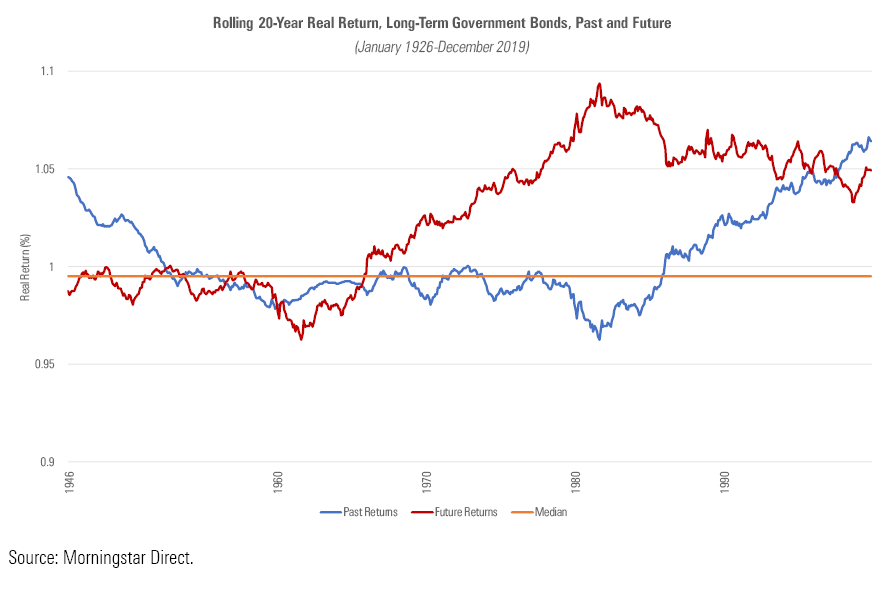
Once again, the time period that suffered the lowest past returns concluded in 1981 and was immediately followed by the time period with the highest future returns. Once again, that event dominated the results, driving the correlation statistic down to a mere 0.08. Those items were unchanged. What was different is the distribution of the red line. With this study, most of that line hovers above the median. This raises the immediate question: How can that be?
The answer: The median comes from the numbers that feed the blue line, and those figures represent different dates from those that populate the red line. The blue line comes from the 20-year rolling periods that begin in 1926 and end in 2000, while the red line's rolling periods start in 1945 and finish in 2019. Thus, the red line jettisons the first two decades of the database, while picking up the final two decades that the blue line could not use (since one cannot calculate future 20-year returns from time periods that concluded less than 20 years ago).
Clearly, replacing the first section of the time period with the final section does something very good for bond returns. How good may be seen from the next chart, which depicts the growth of $10,000 for long-term government bonds during the tenure of the database. (The scale is logarithmic, so that percentage changes that are the same size occupy the same space on the graph.)
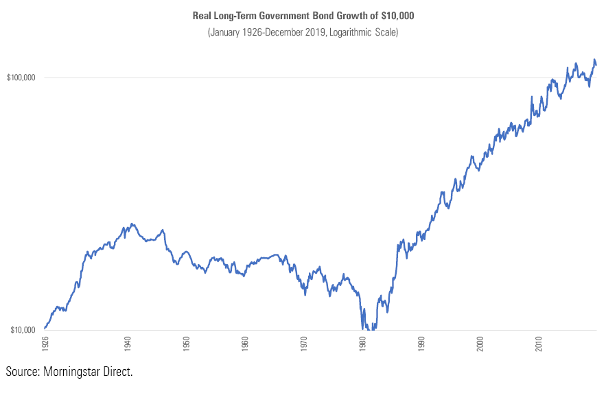
Since 1926, high-quality bond returns have undergone three regimes:
1) Strong growth, through 1941
2) Gradual decline, bottoming in 1981
3) Strong growth again, through today
That’s it. The story of the high-quality bond market over the past 80 years, expressed in real terms, has quite simply been that bonds struggled for four decades, then rallied for the next four decades. Well, 39 years to be exact.
Wrapping Up That we are but 12 months away from completing the apparent pattern isn't particularly worrisome. Just because long bonds were uninspiring for 40 years, then excellent for 39 years, doesn't mean that they will thrive for only one additional year before resuming their next four-decade cycle. To believe that is to believe numerology. One might as well cast horoscopes.
That said, with bond yields at their historic lows (even lower than when government bonds began their previous slump, in 1941), one needn’t possess a vivid imagination to wonder if, perhaps, the current cycle is nearing its end. In contrast with the rolling 20-year U.S. stock returns, which showed that equities should fare well if the historical pattern continues to hold, the long-term outlook for government bonds looks to be less attractive.
John Rekenthaler (john.rekenthaler@morningstar.com) has been researching the fund industry since 1988. He is now a columnist for Morningstar.com and a member of Morningstar's investment research department. John is quick to point out that while Morningstar typically agrees with the views of the Rekenthaler Report, his views are his own.
The opinions expressed here are the author’s. Morningstar values diversity of thought and publishes a broad range of viewpoints.
:quality(80)/cloudfront-us-east-1.images.arcpublishing.com/morningstar/OMVK3XQEVFDRHGPHSQPIBDENQE.jpg)
:quality(80)/cloudfront-us-east-1.images.arcpublishing.com/morningstar/WJS7WXEWB5GVXMAD4CEAM5FE4A.png)