
Can You Predict the Next Downturn?
The longer the time period, the stronger the pattern.
/s3.amazonaws.com/arc-authors/morningstar/1aafbfcc-e9cb-40cc-afaa-43cada43a932.jpg)
From the Mailbag A reader asked:
"Looking at current 10-year returns gives me a sinking feeling in the pit of my stomach which I have experienced twice before, during the tech bubble and the financial crisis. Is there any data regarding significantly higher 10-year returns being negatively correlated with lower subsequent 10-year returns (like the tech boom followed by the 'lost decade')?"
My initial answer is that there is a loose inverse relationship between past and future 10-year returns, but so loose that one cannot make money off that information. This column provides the figures to defend--or refute--that assertion. In addition to showing the results of 10-year returns, I also examine five- and 20-year periods.
The data series begins in 1926, not because that year was particularly memorable for equities, but instead because it commences Ibbotson's Stocks, Bonds, Bills, and Inflation database (which is owned by Morningstar). The returns, from Ibbotson's Large Stock Index, are monthly and real, meaning that they adjust for the effects of inflation. (Using nominal returns would be grievously misleading, given how greatly the rate of inflation has fluctuated.)
Each of the three following charts contains three lines:
Blue represents the average annualized return for the past rolling time period. Thus, for the five-year chart, the 11% amount that is shown above the year 1931 represents stocks’ annualized gain from the years 1926 through 1930.
(I was surprised that the 1926-30 results were so resoundingly positive, but despite the lore surrounding October 1929’s Black Thursday, the worst Great Depression stock-market returns came later, in 1931 and 1937.)
Red represents the average annualized return for the future rolling returns. Thus, for the five-year chart, the 6.35% amount that is shown above the year 1931 represents stocks’ annualized gain from the years 1931 through 1935.
(Once again, I was surprised. Stocks profited during the heart of the Great Depression? Yes they did, at times, although that red line soon plunges. Not only did Wall Street periodically rally, but the nation underwent steep deflation, thereby boosting the real value of equities.)
Orange represents the median return for the rolling time periods.
Interpreting the pictures is therefore straightforward. If, for a given date, the blue and red lines land on opposite sides of the orange line, then past returns were an inverse indicator of future results. High past returns led to low future returns, or vice versa. If, on the other hand, the blue and red lines place on the same side of the orange line, then the signal failed. Strong begat strong, or weak begat weak.
5 Years
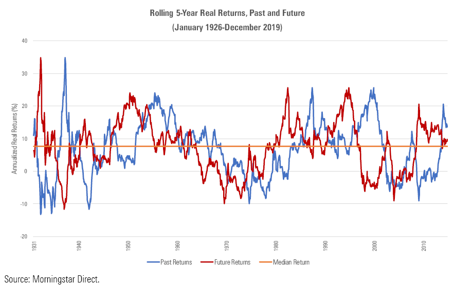
What a mess! There’s no point in attempting to analyze the splatter of these tea leaves. (Pity the poor investor who attempts to construct a market-timing barometer based on those totals.) The negligible correlation statistic of negative 0.09 confirms the uselessness of five-year equity returns. Knowing what happened to U.S. stocks over the previous five years sheds little insight, if any, about what will occur during the next half-decade.
10 Years
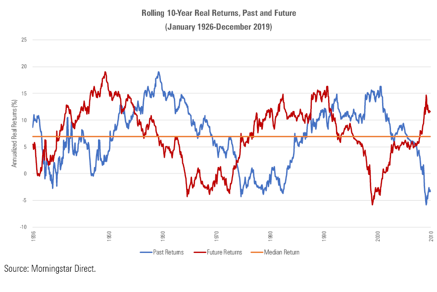
This is better. Early 10-year losses were followed by the highest 10-year gains of the entire period. Later, just past the halfway mark, a similar pattern occurred, with bottom-basement performance succeeded by above-average future results. Then--as the reader lamented--the highs of the 1990s’ tech boom presaged the lows of the “lost decade.”
However, the blue and red lines do land on the same side of the orange line one third of the time, which is too often for a long-term signal. Batting .667 is great when making small bets, as with constructing a portfolio, but it is insufficient when making a single 10-year commitment. Given the length of time that the wager requires, there won’t be enough betting opportunities to ensure that the law of large numbers will work in the investor’s favor.
The correlation is negative 0.25, high enough to be suggestive but not so high as to be practically useful. My response to the reader stands.
20 Years
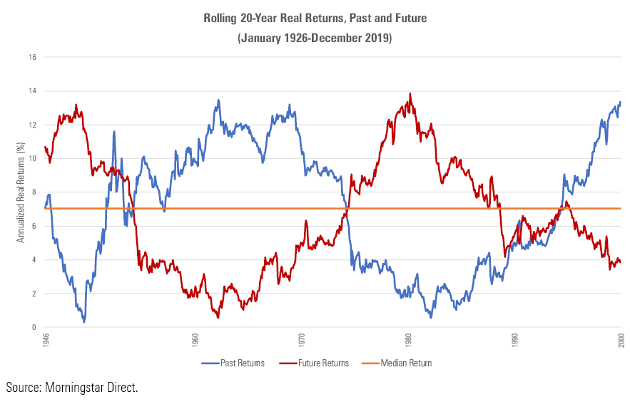
And now for something completely different. One could not hope for a clearer picture than what occurs with the 20-year chart. When blue is up, red is down, and the converse. There are only brief stretches when the two lines appear on the same side of the median, and in those instances the returns are close to normal, so the signal doesn't flash brightly. The graph looks so clean that one suspects that its author erred. (The thought did initially cross my mind.)
This portrait is dominated by five events:
- The depression/war years (weak results)
- The 1950s/1960s (strong)
- The 1970s oil crisis (weak)
- The 1980s/1990s (strong)
- The 2000s (weak, in fact considerably worse than the 1930s)
Consequently, these results not only lack statistical significance, because the 648 monthly observations so thoroughly overlap, but they also fail common sense. That buoyant economies generate optimistic stock valuations, which eventually decline as the economic news worsens, makes sense. But that such events have occurred on a seemingly regular cycle is surely accidental. The pattern’s apparent inevitability is a mirage, based on a tiny sample size.
That said, I suspect the 20-year numbers offer a fair guide to the future, if not as accurately as their negative 0.84 correlation suggests. (Now that's a correlation!) Secular economic changes do tend to occur gradually, and investor emotions can overshoot the mark. Although the letter of this finding need not be observed, its spirit deserves some respect.
Which implies good news for the U.S. stock market, as entering 2020 the real 20-year return on equities was a modest 3.85%, well below the historic norm. These days, it has become commonplace to bemoan high stock prices. Perhaps the skeptics will prove to be correct. But 20-year return measure foresees a happier outcome.
John Rekenthaler (john.rekenthaler@morningstar.com) has been researching the fund industry since 1988. He is now a columnist for Morningstar.com and a member of Morningstar's investment research department. John is quick to point out that while Morningstar typically agrees with the views of the Rekenthaler Report, his views are his own.
The opinions expressed here are the author’s. Morningstar values diversity of thought and publishes a broad range of viewpoints.
/cloudfront-us-east-1.images.arcpublishing.com/morningstar/HDPMMDGUA5CUHI254MRUHYEFWU.png)
/cloudfront-us-east-1.images.arcpublishing.com/morningstar/OMVK3XQEVFDRHGPHSQPIBDENQE.jpg)
:quality(80)/s3.amazonaws.com/arc-authors/morningstar/1aafbfcc-e9cb-40cc-afaa-43cada43a932.jpg)